Idk about shadow, but the cause of the animation looking weird could be the gif recorder recording at a lower fps compared to what the game is running at, used to happen to me. If it isn't his south run state looks like a gallop which can probably be fixed by rearranging the order of the frames for the icon state, or by removing the state where both of his legs are not touching the ground and are bent at the same angle...
In summary-
@Kidpaddle45 : Sweet minimap man
Cheesy pants wrote:
Idk about shadow, but the cause of the animation looking weird could be the gif recorder recording at a lower fps compared to what the game is running at, used to happen to me. If it isn't his south run state looks like a gallop which can probably be fixed by rearranging the order of the frames for the icon state, or by removing the state where both of his legs are not touching the ground and are bent at the same angle... ^ Exactly what he said :) I recorded this at low quality + in 10 fps...so yeah it definitely made the gif not as good as how it really is in-game but I thought there are no reasons to make my GIF file any larger when all I want to show is the minimap ;) | |
 WIP | |
 Part of the temple for the high god of light, also the log in screen of my mage rpg, Arcane Chronicles. If you're interested in following how the game progresses: Hub: http://www.byond.com/games/Magus8/ArcaneChronicles Discord: https://discord.gg/YQg6NnC | |

 | |
 Funny little NPC that gets excited when someone about to enter his building! Planning on adding loads of NPCs to give life to this map. It turned out a bit too big but oh well... | |
Hey, I am making an original game and would like some feed back on the Hud.
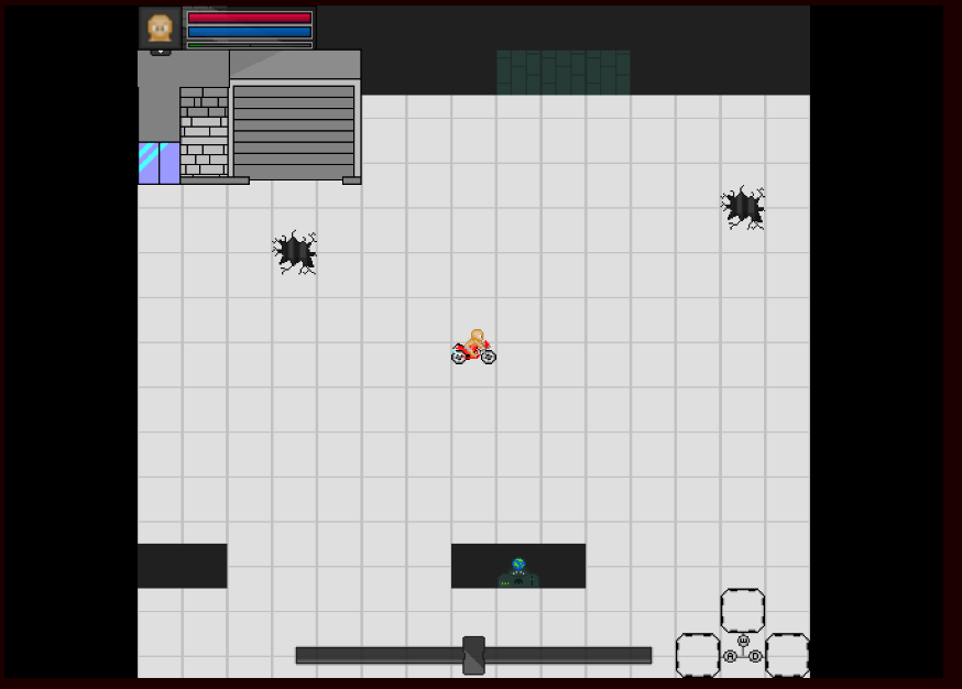 The top right shows the profile, health, energy, and exp. By clicking on the profile(Head) you see your stats, missions, etc. Clicking on the arrow gives you your inventory, skill/passive trees, and options. 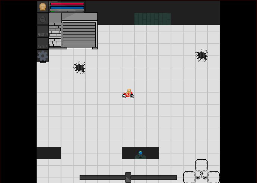 The bottom bar is the morality bar. The bottom right is the 3 skill slots. | |
Morality bar seems pretty enormous compared to all the other elements. I would make the inventory arrow larger, maybe as broad as the portrait, and include 'inv' or 'inventory' on there to make it cleaer. The morality bar could be similarly sized to the health/mana bars and oriented right, maybe? How critical is it to know your precise morality right at this moment?
| |
I made it big because "almost" everything you do can change it and I thought it would balance the whole hud out a bit.
| |
Another longer solo demo video courtesy of Maximus_Alex2003! Showcases waves 1-10 at 60fps 1080p. (: | |
Multiplayer chaos! | |

The new UI bar may not be looking very elegant but it is a huge convenience to gameplay now! And uhh, also there's a quite successful taco shop in the background.
 | |
 Skill tree through constellations | |
Recently started adding classrooms to my Academy :) slowly closing in on testing phases, after getting these classrooms added in I'm going to get started on Quest NPCs for it and get the Tutorial sequence set up and I'm pretty much good to go :)
 | |
 Got tired of my art looking terrible so I'm going through some personal training for art. First test is making a convincing rock. Thoughts? All I know for sure is that it looks like a bit like a brain lol | |
Lost focus on minimap as soon as I saw the shadow wonking out and the fact that the character's movement animation seems.... weird.