Dec 2 2015, 10:49 am
|
|
Konlet
|
Animations and matrices really have changed the way so many developers do things in BYOND as far as graphics go. For me, definitely. I feel like newer tools like this should be more focused on for improvement.
|
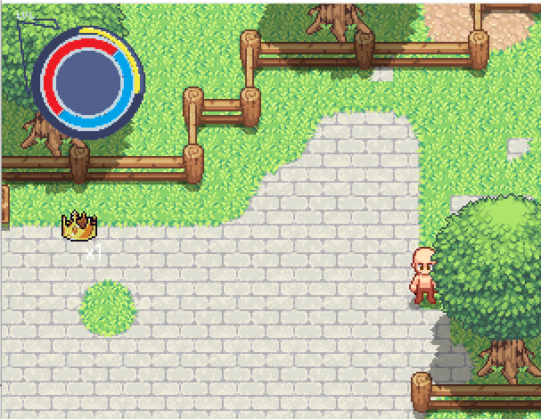
 Charged shots. Still need to work on an animation to show that you are charging, but it's functional at least. | |
Bravo1 wrote:
Absolutely gorgeous effect. | |
just showing off my health system.
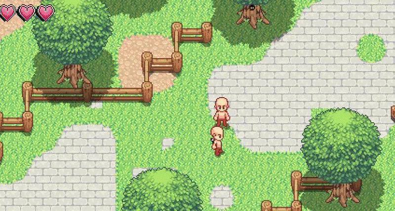 | |
That's.. odd. Make it the inverse of it's current iteration. Not sure WHY you're doing it left to right instead of the other way around...
| |
Yeah, you should always preferentially have the middle of the screen be empty when designing a game interface, or else it looks 'lopsided'.
| |
Also if you're using the heart health system please take off the numerical on-screen text for your damage proc. It's redundant.
| |
Try the Zelda approach to bombs, giving more feedback about when they're about to explode. Make them start growing slightly about a second before they detonate to really give it some tension.
| |
Looks nice. You could cut down on the number of particles and improve performance if you create particles based on either the velocity vector of the projectile at impact, or the normal vector of the surface at impact.
It also looks a little weird that some particles are going through the blocks. | |
RoxasX-San wrote:
Also if you're using the heart health system please take off the numerical on-screen text for your damage proc. It's redundant. It depends on how it's implemented, but displaying numerical damage values while using a heart system is certainly bad, as it doesn't give clear feedback. My suggestion would be to only display damage done to enemies, and never show it for yourself (since you can look at your own heart level). The damage done should then be the number of hearts of damage they took from the hit. | |
D4RK3 54B3R wrote:
Looks nice. You could cut down on the number of particles and improve performance if you create particles based on either the velocity vector of the projectile at impact, or the normal vector of the surface at impact. IMO, flattening the entire particle effect into a single icon would be a reasonable approach. To get around the issue of particles passing through the blocks, IMO the effect should be layered under the walls. Ideally in a sidescroller you don't tend to want your actors to overlap walls anyway, so it's a convenient way to reduce CPU overhead while maintaining a reasonable suspension of disbelief. | |

Something nice to add would be dividing the heart into individual pieces and taking out a portion of it every time you're attacked, depending on damage of course. Right now it looks kind of weird how you're attacked and sometimes it doesn't take a heart
| |
I sort of agree somewhat.
Though me personally wouldnt even use hearts i would use something that better represents health in the lore. For example look at this.  and this  Health bars from some of my favorite games (Jak and daxter :D). Also an example of the heart breaking off thing.  From the precursor legacy. Though your health was maxed at 3. | |
this better?
 | |
To big :P.
| |
all i got to offer :(
| |
I would offer to make one but knowing my terrible pixel clicking skills it's more than likely going to look way worse than what you have QQ.
| |
99 pages 1 more page left
| |