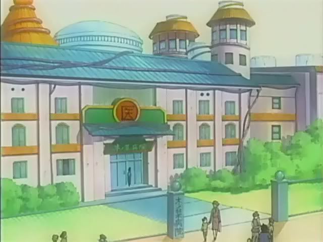
Soo...
My Hospital =)

My old Hospital =(

Just so you can see the improvement.
C&C welcome.
ID:258089
Jun 2 2008, 6:58 am
|
|
I haven't posted something in ages, so i thought i might.So im going to post a remake of an old icon i made.
Soo... My Hospital =) My old Hospital =( Just so you can see the improvement. C&C welcome. | |
Jun 2 2008, 7:19 am
|
|
MadaraUchiha2007
|
That is so awesome! :O
|
One suggestions is..
Make the stairs shades flipped, first one is lighter getting darker. Because, lighter shades represent a closer objects, darker shades represent further objects. | |
look at these references, you will see where you went wrong, as in the design lol
http://i93.photobucket.com/albums/l79/Toph_earthbender/ Naruto/stuff/NisabureLocation-KonohaHospital.jpg http://www.narutoglobal.happyhost.org/Hospital2.jpg the first one id class as unusable in a game, 8 directions you should draw the buildings out which is ofcourse North. East. South. West or if your doing isometric's style then north-east, south-east, south-west and north-west lol really take a good look at the references and draw what you see(keeping the scales in mind, draw everything first, after that is done you can colour and shade and all the other details, eh how this info helped you lol | |
unusable in a game? explain.
I wasn't exactly basing it off the show either. I went sort of, creative. | |
because it has a flat front and the side is angled to the side lol
it may work but IMO it wont look right. | |
Chris-g1 wrote:
because it has a flat front and the side is angled to the side lol I wouldnt say its unusable at all. The trick with the way he went about it is he is going to have to give his bases diagnal movement states (northeast, southwest etc.) to enter the building smoothly. Its creative in that aspect, but results in more work to complement it. Personally I'm not much of a fan of the bright blue windows. It takes your focus away from the rest of the building. Try greyscaling the windows, or bringing down the saturation on the blue atleast to match the colors of the building. Onto the rest of the building, it has a gradient look to it, mainly because it has no real lightsource. Try making better use of the shadows and lightsource you're using. If the lightsource is coming from the right, the front of the building should be darker than the sideIf its coming from the left, then only the top of the building should show it, maybe the corner of the left side aswell. | |
He may going for an isometric approach, http://www.pixelfreak.com/i/07/index.html.
| |