ID:258134


Still a work in progress.
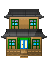
A Japanese house I'm making for a game.
Need some C&C on where I should go from here. xD
If all goes well I plan on adding in a lighter shade towards the top of the building, but I wanted to see if I was heading in the right direction.
Man that looks great, I love the gradient + light source effect you did with that.(Not saying you used photoshop, but i'm saying that style).
In response to Bakasensei
Bakasensei wrote:
Man that looks great, I love the gradient + light source effect you did with that.(Not saying you used photoshop, but i'm saying that style).


Thank you very much! =)
The gradient style gave it some depth, its a new style for me.
Im thinking of using it more often,xD.

I can say im pretty happy with the result.


I might play with the pallet later, for fun, xD
W1ldr3x wrote:


Still a work in progress.
A Japanese house I'm making for a game.
Need some C&C on where I should go from here. xD
If all goes well I plan on adding in a lighter shade towards the top of the building, but I wanted to see if I was heading in the right direction.

There's some clashing perspective here. You can see the top of the deck, but you can also see (What I assume is) under the roof. Normally you'd only be able to see one or the other. If you can see on top of the deck, you'd see the top of the roof instead of under it. And if you could see the underside of the roof, you'd only be able to see the deck from the front. Hope that makes sense. I assume you're going for 3/4 perspective like most Byond games so I'd suggest aiming for top of the deck, top of the roof.


More volume, visibility, and make it look less like a flat false building


Course if that's not the perspective you're goin' for or that wasn't supposed to be the underside of the roof, forget I said anything.
In response to AmonR
AmonR wrote:
W1ldr3x wrote:


Still a work in progress.
A Japanese house I'm making for a game.
Need some C&C on where I should go from here. xD
If all goes well I plan on adding in a lighter shade towards the top of the building, but I wanted to see if I was heading in the right direction.

There's some clashing perspective here. You can see the top of the deck, but you can also see (What I assume is) under the roof. Normally you'd only be able to see one or the other. If you can see on top of the deck, you'd see the top of the roof instead of under it. And if you could see the underside of the roof, you'd only be able to see the deck from the front. Hope that makes sense. I assume you're going for 3/4 perspective like most Byond games so I'd suggest aiming for top of the deck, top of the roof.


More volume, visibility, and make it look less like a little stand up prop.


Course if that's not the perspective you're goin' for or that wasn't supposed to be the underside of the roof, forget I said anything.


It was going to be the sides of the roof heading towards the back of the house,
but your way works to. xD
Looking good Rex. I shit myself when I saw this, since the last time I saw it was all...green. o.O
You're getting good with houses, yo.
W1ldr3x wrote:


ok having that shadow go right the was across makes it seem like its all on one level, try fixing that because a roof tile level should come out more at you then a wall under it, same with the stairs, the shade wouldnt keep that line because again its coming out at you, the riles on the roof are pretty messy so try correcting them and making them even(ofcourse adding a pixel or two as it curves out on the sides), not a bad start though, i will probably come back later and edit what i said up if you havent done it =D

good luck.
In response to Chris-g1
Alright, but im using the edit amon gave me for the roof.
I'll try to fix it up. XD