ID:258135
Jul 14 2008, 2:04 am
|
|
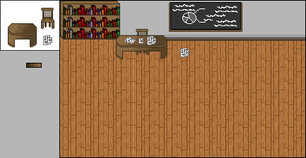
Classroom template/basic design I'm working on. Student's desks are on the left, the little small one.
| |
KashikoiMeisai wrote:
Classroom template/basic design I'm working on. Student's desks are on the left, the little small one. dither on the table is wrong IMO also if your going to have a direction of light to shade stick with it the whole time... | |
Where did I stop following the light source? The only things that are shaded that way are the books and the desk, and they both follow the same light source. High, and left. The wall does too. Why is the dithering wrong on the desk? Care to explain? o.O
| |
The book shelf to me looks horrible and out of porportion(sp?) The inside wood should be darker and shaded, the books don't look like books at all to me, you should re-do that, but everything else looks fine though you over-shaded some stuff(Like the desks).
| |
KashikoiMeisai wrote:
Where did I stop following the light source? The only things that are shaded that way are the books and the desk, and they both follow the same light source. High, and left. The wall does too. Why is the dithering wrong on the desk? Care to explain? o.O sorry to come across as a moaner lol the dither looks messy =/ this should clear up the light source thing and a template i came across on dither styles  as for the shelf of books...  also using isometric's didnt come across as effective when used in a non isometric scene =/ sorry this is just how i see it lol *Edit* also for the wall.... that looks like you dithered for the sake of it lol if your going to do it, lower the diffrence alittle on the pallet you use good luck =D | |
Okay, I guess I can redo the shading then redo the entire bookshelf. It was my least favorite thing in the room anyways. XD
By the way..most of those dithering styles look....stupid/unusable...o.o | |
Diffrent styles of dither are effective in diffrent areas and shapes... just depends on how you use them and the pallet which they are used with... i wouldnt have posted them if they wernt effective techniques to use =P
| |
KashikoiMeisai wrote:
Okay, I guess I can redo the shading then redo the entire bookshelf. It was my least favorite thing in the room anyways. XD The dithering on that table is honestly not a problem, there's many more things on there worse than that, lol (I'm proud that everyone has done a great job so far of pointing these things out). Randomness is makes things more interesting, there's a difference between what's messy and what's appealing. And if you're going to use organized dithering it's always cool to switch it up with other dithering styles or go random from time to time. Not only do you have multiple light sources (I mean I don't see any torches or legitimate sources that would cause the extra light) but you have multiple styles, for instance your dithering is not consistent. The table was dithered but the chair wasn't. Suggestions: 1. How about doing just a tiny bit of dithering on one object and a tiny bit on another? 2. It seemed like on the chair you were using the light to establish it's perspective rather the give it light, if so don't make the light nearly that powerful you already had the outlines laid out to identify it's position fine. | |
Wow, thanks a lot Hulio. That post like...really helped me. :P
Okay, I updated all my icons, and erased the insides out of everything, then recolored. I tried something new on the bookshelf, I think it gives a little bit of depth, I'm not sure. Also, ignore the wall icons, because I didn't make them. 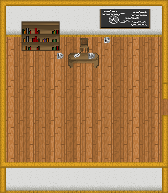 Everything has been put into DM and mapped, which explains the reorganization of the room. Tell me if I have improved any, and how I can improve even more. (And thanks everyone for your help. :P) | |
When I opened it up I was like man those walls look familiar! But anyways the books should have depth and the book shelfs insides still wouldn't be shaded like that. The books have no depth, and it has random/wrong shading. But its a bit better, well your getting the idea.
| |
cough he said basically what i said >_< cough
ok now you need to fix that bookshelf because dimention wise its mess up, the shelfs seem to be perfectly striaght as it it was side scrool and everything else isnt, so make it look like there not balencing on nothing, as for the tables shade just go for the light source of any normal room... (the edits were rough to show you what i mean)  | |
Chris-g1 wrote:
cough he said basically what i said >_< cough You told me my dithering was nasty. Nahh, I know you both said relatively the same thing, he just organized it and made it easier to understand (which is good, since I'm kinda slow sometimes). ok now you need to fix that bookshelf because dimention wise its mess up, the shelfs seem to be perfectly striaght as it it was side scrool and everything else isnt, so make it look like there not balencing on nothing, as for the tables shade just go for the light source of any normal room... I swear to god on everything I was like "Damn...I need to add in the backs of the shelves and make the tops of the books..", but I had already uploaded to photobucket and I was in official "fuckit" mode. XD So do you want me to change the lightsource on the table, but not on the chair? That's kinda silly. :P I will get to work on it again. My progress is friggin slow, lol. (Thanks for sticking with me.) @Baka: ................^_^ I just added another icon to make them taller, lolz. | |
The shelves need to have that top down view as well. Take another look at Post [link] and visualize a book shelve being flipped towards us.
| |
 Really good edit Chris...didn't have to change much but the shade of the book color and some things around it. Any better? | |
KashikoiMeisai wrote:
On a side note, I'd say experiment with your ramps when you're finished building everything. They're very basic and bland. Otherwise, this is coming along nicely from what you began with. | |
Like the books on the shelf, and the random papers on the floor.
The chalkboard to. Nice touch.
Good job. =D