still a work in progress but i wanted to show how it is so far

EDIT

Almost there, i also slow the animation a bit so you can see it better
Also i need some suggestions as to what to do for background
ID:258194
Jul 31 2008, 6:17 am (Edited on Jul 31 2008, 9:45 am)
|
|
Well i haven't pixel in a really really long time because of the lack of time and a virus in my computer, so now that i got a little bit of time i decided to pixel something. and what better way to challenge my self then to participate in a pixeljoint challenge,http://www.pixeljoint.com/2008/07/28/2609/ Pixel_Art_Challenge-_Masquerade.htm
still a work in progress but i wanted to show how it is so far EDIT Almost there, i also slow the animation a bit so you can see it better Also i need some suggestions as to what to do for background | |
Jul 31 2008, 6:32 am
|
|
Lord Ulquiorra
|
Very nice, but since it was animation it was hard for me to see.
|
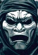
The cloak(Turban?) needed a bit more smoothing out. The mask completely owned, but the cloak looks...off.
| |
Thats why is in work in progress? xD i havent finish it yet i still need to workon the cloak and background and only got 4 days
| |
For the sake of good presentation. Don't just provide the W.I.P animation, we literally cant see it. Provide a still image to go along with it. Usually people post the still artwork as the main attraction and then underneath they post the W.I.P in a link (which we have to click to see).
If you want to stand a chance in that challenge pick up these little crit's I give you. <font color = #12ff00>Green</font color = #12ff00> - The hope in this image. <font color = #f15634>Red</font color = #f15634>- Banding (Please see: http://img402.imageshack.us/img402/5743/bandingmu5.png for banding.) <font color = #fcff08>Yellow</font color = #fcff08> - Pillow shading/Double Outling (Please see: Post [link] for double outlining.) <font color = #4278ff>Blue</font color = #4278ff > - Bad dither abuse that wont get us anywhere. <font color = #b33793>Purple</font color = #b33793> - That old messy/jaggedness you used to do. You don't need all these outlines use the black as the outline so you get a sharper/crisper image they just give off that pillow shading effect and thats what's dominating this image.   Reply # 2 (Apparently you posted the hoody as as I writing this)  The hoody consists of a combination of banding and pillowshading. You must look up proper AAing as well as proper shading techniques. 1. Your banding = (what it REALLY is) notice how everything line ends at the same spot, everythings all lined up this creates a blurry effect. AAed Fix = (what it REALLY is), notice how none of the lines end at the same spot, you'll be amazed at how awesome your stuff would look if you used this as your mentality when AAing/shading. 2. Bad Habits & Techniques = Good Habits & Techniques Stop surrounding your shades (this is pillow shading!) and let your light colors breath. 3. Dithering Maniacs (And no it's not a style Bakasensai) = Proper dithering control. | |
Yeah, even I, will say that is WAY to much dithering, on a metalic or smooth surface like that you should really use less and try to make everything smoother, if there aren't any pallet limitations USE THE COLORS! I've learned from my waze Hulio ^^, I was sorta stuck in a 3-bit mode for awhile and had to dither everything I saw, but now its getting out of me. Also I think the robe, unless its silk, is a little bit too shiny, and it doesn't blend right with the mask. It feels like its a background image. Also as Hulio said, the chin needs some work, make it more smooth and a little less flat. Also there are some thickly shaded black lines that are kinda random to me that go through, on the forehead(mainly), chin, and small ones on the nose. If it where all like a real mask it wouldnt have as many dimple spots like that. You also should try adding in somewhat of a lightsource and adding highlights to your lightest shade, but just small portions of it. Though you already are using white for alot of it, and thats as light as you can get!
Really pay attention to what Hulio said though too, there are some bad things, like the over usage of dithering, the banding, the jaggedy lines, and such. Also some points are like under the cheek bones, you could add in a very dark shade, you didnt shade it dark enough just used a small shade while parts that shouldnt be shaded that dark(Like on the forehead) are pure black. So go through and re-shade a couple of things that shouldnt be what they are. Also I was thinking the hoodie would cast a small shadow over the mask a bit in some parts on how you put it, though it ma not but since I think it might of other people will too, so you should try and fix that up. I'll look at some more stuff to help you out but focus on what we had to say so far. Also thanks Hulio for posting hte image so I could actually see it ^^. If you find anything wrong in this post just say something and i'll look into it i'm rushing a small bit so make sure what I say is right. | |
Thx for all the crit i'll fix everything and post it later i didnt polish it so thats why it had a lot of jagged lines and the pillow shading i guess i was used to it i did it unconsciously
| |
http://www.chasingthefrog.com/reelfaces/300/immtal.jpg Wanted to post the reference since i forgot and that way i could even more tips
| |
Aie miguelito sup.
| |