ID:258386
 
I was observing Unwanted4Murders post about Left 4 Dead and sense I got it about a month ago and love the game I decided to make some icons.

Current Hunter:


Reference:
http://www.garrysmod.org/img/dl/56879_2.jpg (Best Picture I could find...)
For those that haven't played the game, Hunter's pounce. That's why it looks like he is sitting.

Current Smoker:


Reference:
http://img508.imageshack.us/img508/2189/ ed2d6el4dartworksmokervc6.jpg
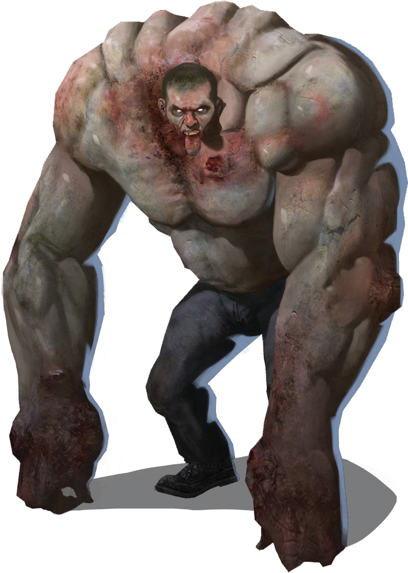
Current Tank:


I give permission to laugh at my horrible tank. I suck at muscles.(Man it looks funny! >.<)

Reference:
http://media.moddb.com/images/groups/1/1/941/ l4d-boss-art-tank.jpg

I think I should make it look more scary looking. I think its a little to cartoony. Might be hard only using 32 x 32. Also, I probably need more contrast.
C & C please. :D

BTW, Thank you to which ever admin moved the post. :D
Must be moved to pixel works in progress for crit I think. I like the 2nd one better but it could use more of those bumps on the icon so it resembles the ref.

btw tounge should be darker.
In response to Rasengan3oo4
Crap.... Whoops.. Didn't mean to post in Non-pixel WIP. Please move Admin doods. >.<

Update:

More lumps and added a little more contrast. Tongue is also darker.
The Tank piece is most readable or atleast it's more clearer then the rest. It seems alot of people have improved their line art since last year but have a problem helping readers identify objects. In other words the piece is flat. The first step would be to actually pick colors that actually have a difference (Theres no contrast here). Then there's the biggest step which would be to actually establish the volumes and shapes. Even if you do have high enough contrast it does no good if shading is done in a wild manner, you'll just end up with some camouflaged effect. That being said shading is all about establishment and "definition", define what you want. You shouldn't have to "outline" when you're "shading"...same goes for muscles, If you simply just think about two things, depth and light things will come out right. Hell any "outlines" or "lines" in general you make INSIDE the piece should be by accident caused by thinking about those two essentials.

Image Hosted by ImageShack.us
In response to Hulio-G
Hulio... your awesome. >.< Lol!

I took your wonderful advise. It did seem extremely flat.

Update:
In response to Akto
You mainly just mirrored it. At the start of the picture you have to think of where the light source is comming from and think about where it would hit, and where shadows would be cast down upon. Flipping images is nearly the same as pillow shading(Just a less radical form). Look in the new tutorial links on shading in the front page for more details on it; Mainly I just did a small edit with the current pallete to show what shades might be where.

In response to Bakasensei
The problem there is now the arm in the shadows lost all the detail he added, and the edge needs cleaning up.
In response to AmonR
He didn't have another shade lower, so I made the edge that way to produce a darker outline on the right(Trying not to use the outline color that much). Also it was just a simple example shading. He can add in the details ^^
In response to Bakasensei
Once again another edit. I love it when the Best pixel artist on BAS help me. :D
Special thanks to:
Baka, Hulio, Rasengan, and AmonR >.<

Update:
In response to Akto
Look at my edit again for a bit, that left arm would cast a shadow down on the chest; it also looks like you have some lighting issues in general on the arm. If you look at the middle, the top, and the bottom, it looks like the light is being cast from teh right a bit, alot from the left, a bit from the top, and a little bit at the bottom.
In response to Bakasensei
Bakasensei wrote:
He didn't have another shade lower, so I made the edge that way to produce a darker outline on the right(Trying not to use the outline color that much). Also it was just a simple example shading. He can add in the details ^^

Ahhhh, but that's where you have to get crafty. The outline color of the shoe made for a great darker color.


Edit of Baka's edit. I did tweak a few colors, and removed some redundant ones. Didn't add any new ones though. 19(?) colors in the original, 13 in the edit, not including background color. Limiting color count is a good way to help you use colors better/make better color choices. I'd also avoid using white as a background color. Makes thing harder to see.

And contrast is your friend! There's no reason to add a color if you can barely even/can't tell at all that it's supposed to be different without zooming in.
In response to Akto
Akto wrote:
Update:

I like this one, just continue from here. The newer edit (mainly left side) got messier due to blurriness and of course...The definition was lost.

I thought this was fine for a "game". But if you really want that light source coming from the right. Just imagine there's an object and you have a flash light; then you just start tilting the light at an different angle. Maybe this will give you a better visual. Post [link]

EDIT: Amons edit is pretty badass in terms of how to tilt a light source so take a look at that.
In response to AmonR
Damn! AmonR... you just blasted me out of the water.

Lol... Man I'm a complete noob. >.< Must practice! Must become like AmonR. Lol!
Color choice seems to be my down fall. I'll work on this when I get back home tomorrow, to tired to continue. Zzz...

Thanks again guys!
In response to Bakasensei
Bakasensei wrote:
He didn't have another shade lower, so I made the edge that way to produce a darker outline on the right(Trying not to use the outline color that much). Also it was just a simple example shading. He can add in the details ^^

In a case like that, the outline would be best to use for the definition.


EDIT: Oh wow...i didnt even see the other edits after bakasenseis. Yeah, id go with amons in terms of how to work the lightsource and definition.
In response to Pmitch
Update:

Quick update before I go to school. I think I kinda went toward hue shading/shifting/coloring (Lol forgot which one)... IDK but I'm starting to like it more.
In response to Akto
Akto wrote:
Update:

Quick update before I go to school. I think I kinda went toward hue shading/shifting/coloring (Lol forgot which one)... IDK but I'm starting to like it more.

You actually handle hue shifting quite well. But on both sides your dark tones aren't dark enough (contrast is low, compare it to Amon's). Your darktones and outline should look natural and it doesn't on that right side, I call that color imbalance. When colors ranges are balanced out well (be it a consistent pattern or whatever) they flow better in transition.

And the outline has problems, it's not really established; there's leaks all over (Amon does it in a way where it's not really a problem. He "implies" there's an outline). If you leave leaks on this character and he's going into a game it's going to look bad, the only time when you should have leaks is when you're working on some picture that has a background.

Review (numbered in importance):
1. Be drastic about contrast. (Drastic as in REALLY make it shift from light to dark...Right now you didn't have to think about this so much because hue shifting helps you with this effect.)
2. Fix that outline, either make a real one or do a better job "implying" there's one that follows through all the way. Be gentle when it comes to modifying the color of the outline, make sure it doesn't change too much that it doesn't even look like an outline anymore like your left arm. See: Softening Outlines
In response to Hulio-G
Update:


Softened the outlines and fixed the outline leaks. :D
Home from school! >.<
In response to Akto


One quick edit the right arm should be closer to the body, because I always try to do everything that matches the reference. Also edited the shading on neck(above head thingy) , it looked all like shading, so edited that.
In response to Rasengan3oo4
That looks like he has a fat arm now. Also are you talking about his hair?

Updates:

I made the hunter's jacket more blue because I thought it stood out more, but I think I might shift it back to a blacker tone because it gives it a more "Darker" feeling. Also, made his arms longer to make him in a pounce... not a squat. Noticed I had outline leaks... that I will fix.
In response to Akto
Make his jacket a little darker and more purple, it will give it a spookier look. The highlights you have are too contrasted compared to the rest of him, make them a tad bit darker, though the dark shades on his hands are barely different. So fix that up first.
Page: 1 2