Think back to the first turf icons you designed. One of them was probably a "grass" or "floor" icon. Did you get an ugly little surprise when you looked at it on the map? Did your subtle, natural artwork suddenly look as artificial as a sheet of graph paper? You've probably already developed your own strategies for dealing with the "seams" between turfs, but if seam removal is still a tiresome chore for you, maybe I can help.
(By the way, all the screenshots accompanying this article were created with WinGrab. You can download WinGrab for free at http://home.chello.no/~wingrab/.) [Update: Looks like WinGrab has gone the way of the dodo. Instead you can try IrfanView.]
 Our final wood isn't going to be red, but this is a good place to start. We'll use four visibly distinct colors to design the icon, and then swap them with more subtle colors once we're happy with our pattern. Here's the foundation -- just choose red and use Flood to fill the icon.
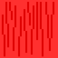 Now we'll select our second color, a darker red, and use the Line tool to draw some vertical lines for the wood grain.
 These arrows will spin your icon. Give 'em a try. Spin it about 16 clicks left and 16 clicks up.
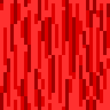
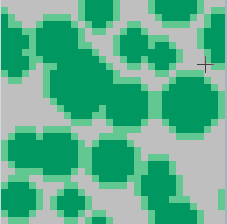
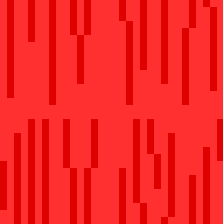 See why we used the spinner arrows? It's now very obvious that our icon has seams.
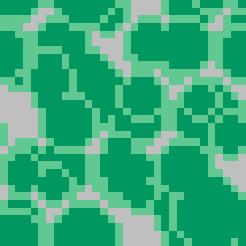
 We'll just add some more grain to make those seams vanish like magic.
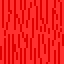
 Now we move on to the next color.
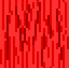
 Again we spin the icon and add more of the same color.
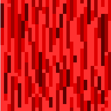 And apply the same techniques with our darkest shade of red.
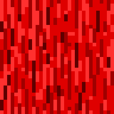 Now we just do some touch-up work -- adding in some more dark areas, spinning the icon willy-nilly, slashing over dark areas with lighter colors, and generally having a grand old time -- until we have something that looks fairly balanced.
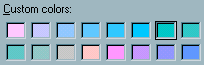 When you double-click a color in the palette, you'll see something like this. The color with the rectangle around it is the color you clicked. (In this image, it's the top row, second from the right -- but the location will vary from color to color.) The other colors are its neighbors in the palette. This makes it very easy to edit the palette so it contains a row of four blocks of the same color. And then you can go to each color in the group and change its Luminosity setting to make it lighter or darker. For our wood grain, we'll create a row of subtle browns.
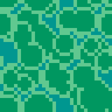
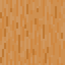 We swap the reds with the browns.
 Eureka!
But maybe you're not impressed with the results of our little wood grain experiment. Maybe you feel it's still too easy to detect the repeating pattern in it, or the color isn't rich enough, or you want the grain to be diagonal. If you feel that way, good -- the whole point here is to show you some techniques that might help you to make something better of your own.
Also, if you're one of those people who just isn't happy coding without a semi-decent set of graphics to test with, this technique can help you create not-too-bad "placeholder" graphics very quickly. (But don't be surprised if your placeholders end up growing on you; simplicity has its charms.) This next perky little icon, an attempt at drawing malachite, took less than five minutes.
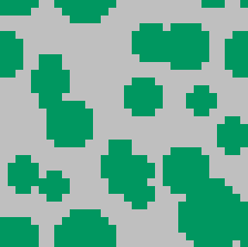 Fill Oval creates a base for us.
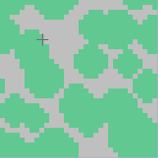 We copy the base, swap to a lighter color, and expand it one pixel in each direction using ctrl-C, ctrl-V, and the spinner arrows. (This technique is covered in more detail in the previous "Man in the Icon Mask" article.)
 The original gets pasted over the expanded version to create outlines.
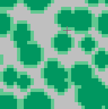
 We make a copy and spin it 16 pixels in the X and Y directions...
 ...then paste one over the other.
 Surviving transparency is swapped with blue-green.
 And we're done.
 Done, that is, until we create another malachite -- again, in less than five minutes -- just to see if we can improve on the original... it's hard to resist the quest for perfect graphics!
 Then we spend hours futzing with the colors... okay, I'll stop.
Let me finish up with a caveat. This seam-removal technique is straightforward in its mechanics, but it requires a talent I can't teach (heck, I'm still trying to learn it myself): the ability to create a mental abstraction of the texture you want to draw. Both our wood and malachite examples are based on my imperfect memory of what wood and malachite look like; their final realism is limited by my own limited understanding of the materials. If I wanted to turn these into really top-drawer icons, I'd take a look at actual wood and malachite -- or at least photos of them -- and spend some time getting a feel for the colors involved and the ways in which the colors form patterns and merge with each other. There's no substitute for research!