ID:38543
 
Keywords: graphics

Why Your Icons Suck


Anyone can make good game graphics if they just keep in mind a couple simple principles. Likewise, anyone can spend hours making graphics, just to end up with junk, if they fall for some very easy to make mistakes. This article is a simple list of dos and don'ts, with explanations. First, we'll start with some commonly seen graphics problems on BYOND.

Don't: I don't want to be a bald guy in a diaper, and neither do your players. An innumerable number of games on BYOND show their character's equipped items as overlays. Though this sounds like a good idea, it is rarely done well (in fact, I haven't seen it done well on BYOND). These are fantasies; people play video games because they want to be a big muscular guy with cool armor and a giant sword, something that most of us can't be in real life. The most important time to show players that they're cool is right at the beginning; if they log in and are shown a bald naked guy, and told 'this is you', they will leave. If you at least equip new characters with cool looking clothing or armor (and it's important that this happen before anything else so that they never see diaper man) then they may stick around long enough to play your game. Which of the two guys in the image below looks cooler to you? Which do you think the average gamer would rather be portrayed as? One is a Knight in resplendent gold armor with sword in hand, ready to kick ass. The other is underwear man. Before we move on, there's a couple more problems with the equipment overlay system. 1: Players rarely have all of one set (Example: all dragon armor), so almost all players look like walking piles of garbage, because the warlock gloves don't fit with the thief coat or the colors on the bishop's hat. 2: Players that want to look like knights (but can't afford all the dragon armor) don't want to look like a cross between a bishop, thief, and warlock. 3: All players at the highest level will have found the best armor, and will then look exactly the same. All in all, equipment overlay systems turn out terribly, and shouldn't be attempted without good reason.

'Base icon' compared to a standard RPG Hero icon.

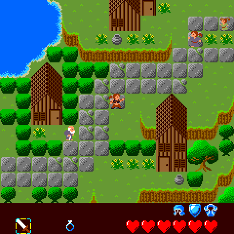
Don't: Players shouldn't have to squint to see your icons. BYOND's standard icon size is 32 square pixels, a very small size on most people's monitors. If your players have to lean close to their monitors to see your awesome graphics, then you're ruining their eyesight for no good reason. There's good news! First, BYOND is making it really easy to work in graphics sizes larger than 32px. Second, you can now stretch out the size of the map. Back in the days of Mario and the Legend of Zelda, player icons were 16px, but nobody had problems seeing them; those icons were spread out onto a large TV, making them easy to see. If you use small icons, then stretch out the map to double or even triple size -- it's the absolute least you should do for the health of your players' eyes. The image below shows a standard BYOND icon as it will appear in an unmodified game; next to it is an icon shown at 200% (as though the map were stretched out); the last image shows the same knight drawn on a larger canvas. Notice how much easier it is to look at the larger images.

Most icons are much too small.

Don't: Using more colors doesn't make your image better. Color helps to establish a visual theme in your game, and objects of the same color will be assumed to be the same material; use this to your advantage. If you use a different shade of brown each time you make a wooden object, none of your images will look like they belong together. By consistently using the same shades of brown every time you draw a wooden object, all the objects in your game will seem like they were made for each other instead of being pieced together from bits all over the internet. Take, for instance, the graphics in this screenshot (from one of my abandoned projects). Notice how a very small number of colors are used, and colors are always reused when possible. The image below shows our golden knight in four colors (left), and then in 31 colors (right). The four color version is more consistent within itself, and will also look consistant with a lot of turf backgrounds. The 31 color version, on the other hand, will look terrible on turfs which, likewise, have 31+ colors.

Using less colors in an image is better.

Let's Recap:

  • Don't use a 'Base' to represent the player.
  • Do give your player a cool icon immediately. Only later, if he chooses to take off all his clothes and shave his head, allow him to be diaper man.
  • Do use large graphics, or stretch out the map.
  • Do use the smallest number of colors you need, and reuse colors to establish a visual theme.
1. I think we can get away without seeing diaper man, but I don't think anyone would quit the game from seeing it as long as there was a shop with affordable equipment around. But there's no reason NOT to give them some starting equipment, either.

2. But I LIKE tiny graphics! :)

3. Although I don't really have any argument for or against using a lot of colors, I don't really see that it makes that much of a difference. The low-color graphic looks like it was made for a GameBoy game. We today are not limited to 4 colors. :P
wow this is really neat! im interested!
You use the idea that all of the strongest players in the game will have the best armor and will look the same as an argument not to use a template as the player icon. How do expect us to defeat such a thing without adding numerous weapons and armors for any given level?
CaptFalcon33035 wrote:
How do expect us to defeat such a thing without adding numerous weapons and armors for any given level?

I don't understand your question, but let me try and clarify my position. Imagin that I'm playing your game, and that I like to portray myself as a magician surrounded by darkness. I would probably want a dark robed figure for my icon. The only way to get this would be to purchase and wear a dark robe. The problem is that the dark robe item might be the absolute worst item in the game. So, if I want to play the game well, I should purchase the magical crystal armor, which is a bright white color, and makes me look like a warrior.

If you provide your users with a set of icons that they can choose for themselves (like a standard set of thief, knight, white mage, black mage, etc.) then your players can look the way they want, while still being able to wear the best items possible.
IainPeregrine wrote:
I don't understand your question, but let me try and clarify my position. Imagin that I'm playing your game, and that I like to portray myself as a magician surrounded by darkness. I would probably want a dark robed figure for my icon. The only way to get this would be to purchase and wear a dark robe. The problem is that the dark robe item might be the absolute worst item in the game. So, if I want to play the game well, I should purchase the magical crystal armor, which is a bright white color, and makes me look like a warrior.

I think its more of a design issue than anything.

There was a game that I fiddled with for a week or two a couple of years back (most of the game I don't really remember), and I recall that at one point I spent a good portion of my time earning enough money to buy a piece of clothing which was nearly worthless as armor... but it looked cool! So I wanted it, and I wore it a lot. However, when I got into a serious combat situation and didn't want to ruin my outfit, I went and switched into my reliable battle raiment.

The moral of the story? Just because something has crappy armor value doesn't mean you can't wear it all the time. It all boils down to this: Do I want to be well protected, or do I want to look cool?

However, you could also provide options such as upgrading equipment, at which point it doesn't matter what has the best armor value, it matters what has been upgraded the most. If you want to have a cool black robe with great armor value, then start upgrading it.

Also, when FireKing's Eternal World game was still alive, I used to have the best armor in the game. However, when I wasn't in a position where I needed it, I would typically switch into something that looked cooler.
One obvious thing designers can do is to allow dyeing, metal plating, decoration, etc. Does the chaim mail look sucky? No reason you shouldn't be able to wear a tunic over it.

If a game is designed to show your equipment it should allow a good way to change the way it looks, within reason. This is something I know Shadowdarke was considering for the future in Darke Dungeon, but as yet still the element of an item has the greatest influence over its appearance.
I agree with a lot about this, especially the use less colors and stretch out the screen stuff. Byond hasnt done nearly enough to suppport larger graphics and the average person cannot handle multi-tile icons properly (flicks mess up, overlays seem like a huge burden and most people cant code movement properly so it breaks apart.)

However on your whole having a base icon whos almost naked is bad point.. I disagree. While i agree that you should start immediately with some clothing, and that you should start immediately with the ability to get some hair. Having a base icon with lots of flexibility is very important. If you make one peice of equipment an entire player icon (gold armor) then your annoying players who just want gold armor with no helmet and maybe a cape.
I don't necessarily agree with the idea of giving him a "cool" icon immediately. Depending on your target audience, it might be quite entertaining to start out in little more than ratty drab earth-tone peasant garb, as long as it looks halfway decent.

Q.v. Puzzle Pirates, where the ragged clothing still managed to look good.
Amen. These games aren't based in Ethiopia, your warriors should be well-fed and well-clothed.
But what if the game IS based in Ethiopia?
objects of the same color will be assumed to be the same material [...] Take, for instance, the graphics in this screenshot (from one of my abandoned projects)

Shall we assume then that trees are made of dirt and that houses are made of some unknown material from the East? ^^
Hiead wrote:
Shall we assume then that trees are made of dirt and that houses are made of some unknown material from the East? ^^

A better assumption would be that both the path and the pots are made of stone, or that all the different green objects are leafy. The similarity between tree trunks and cliff faces is an example of reusing colors where possible (ie. no one will misinterpret the use of colors to mean that the tree trunk is made of dirt).

The use of similar colors to portray similar materials isn't a hard and fast rule; it's another tool an artist can use to establish a theme, or to give the player a better feel for the object.
IainPeregrine wrote:
no one will misinterpret the use of colors to mean that the tree trunk is made of dirt.

What if your trees are growing in dirt?
I agree to some extent, but I think you missed the part where you put outlines on icons so they don't blend into each other. Having trees growing in a field can be a problem if all you see is trunks.
Also I'd like to point out the fact that you have 3d objects mixed with 2d objects. That looks pretty bad..
Foomer wrote:
1. I think we can get away without seeing diaper man, but I don't think anyone would quit the game from seeing it as long as there was a shop with affordable equipment around. But there's no reason NOT to give them some starting equipment, either.

2. But I LIKE tiny graphics! :)

emo_luvver: If you like tiny graphicks just choose a smaller map size, or with 4.0/4.1 just drag the browser window side to the left it will shink up alot.

3. Although I don't really have any argument for or against using a lot of colors, I don't really see that it makes that much of a difference. The low-color graphic looks like it was made for a GameBoy game. We today are not limited to 4 colors. :P

Really, I don't think a player that's not an iconer and doesn't work for making games would ever notice the difference between the two last ones. God, I've been iconing for 2 years now and I don't notice a thing except the sword, shield, and horns, and I doubt thats a 25 color difference... Anyway, Overlay system is great, the points you had against the overlays system were actually against a basic equip system, which makes all high levels look the same. Overlays aren't like that, and 99% of the games on byond arent based on knights and middle age and stuff that makes level 1000 armor the last one and everyone has to wear it, in most games clothes can be wore by anyone, and your problem can be solved just by iconing more clothes for each level, ex; level 60 Armor. Level 60 Robe. Level 60 T shirt and pants. Level 60 mask. Level 60 anything you can think of, and then the level 60's can choose their own style instead of looking the same. But, even if u dont use overlays, people will like the icon that came out best, and you can't change their mind, if an icon looks really good, then people would use it either way. Diaper-man is one of BYOND game's main attraction, like all games have it. Yes, there should be default clothing, and yes, there are default clothing in the games I'm making, but, if he doesnt wear anything, then he should be diaper man, cause thats the base. But, he gets a hair / clothes / weapon at character creation. What I'm saying is, a lot of what you said can be easily solved, and I don't think it's anything any player would have a problem with, and a page such as 'Why your icons suck' shouldn't really be used here, cause like, damn, it's just a few things that a non iconer wouldn't notice, no need to insult us here, ya know.
Uchiha0303 wrote:
What I'm saying is, a lot of what you said can be easily solved, and I don't think it's anything any player would have a problem with, and a page such as 'Why your icons suck' shouldn't really be used here, cause like, damn, it's just a few things that a non iconer wouldn't notice, no need to insult us here, ya know.

The only reason they don't notice is because they're used to it. On ps1 we never complained about the graphics because we were used to them but now that they've raised the bar and put up ps2 we started thinking ps1 graphics suck. If you've built your skill up as far as Iain has you'll just look around at what people are doing with their pixel art like "wtf are they thinking?". Just like Garthor does when he see's poor programming.

They may seem to be tough on people but in the end they are doing this for the community and trying to help Byond develop.


Question : How do I Change the Size of My Icon in My Game?
My icons dont suck, YOU SUCK. *cries*
Yami no Yugi wrote:
Question : How do I Change the Size of My Icon in My Game?

Yes, I'm trying to do bases that are 64X32, how do I use those and make it so they aren't resized?
Page: 1 2