This was the old version:
I based it on how games (particularly the original Ultima III) had looked on my school's old monochrome Apple IIs.
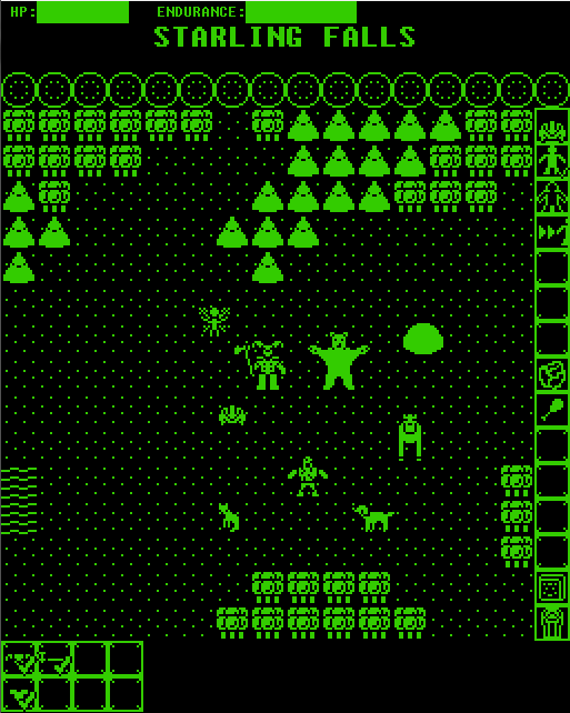
This is the new version:
Despite the facelift, the game is still largely the same. The graphics are just a better fit for what the project ended up being. They're more of a blend of elements, since RetroQuest is a blend of ancient gaming influences and not just an Ultima Trilogy clone.
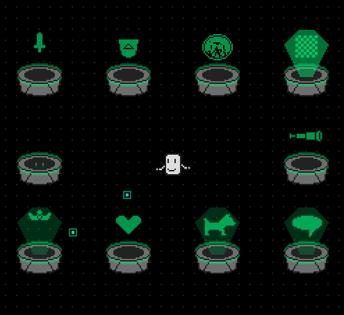
The character icon is based on the smiley faces available in the old ASCII extended character sets that were so common for DOS shareware games. By making the character a giant head instead of a tiny stick figure, I can fit an actual range of expression in and make a character with less detail feel more alive.
The main palette uses a very limited range of grays with a slightly darker palette for the background (because contrast is important when working with limited colors). Green (and amber, the other standard for monochrome monitors) is used as a highlight color, to symbolize magic and objects of power.
The wells here are part of the character creation/customization system... the character is throwing green pixels into them to allocate points into specific skills/areas. They also show the ASCII influence, being basically a zero turned on their side... I might rotate the base icon to make that more apparent, haven't made up my mind.
It's quite a change from what I originally envisioned when I started the first version of RetroQuest a couple of screennames and many versions of BYOND ago basically as a gag game, but it's certainly easier to look at and does a better job of conveying the nature of the game, the blend of old and new.