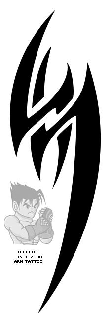
I wanted to make an image of Jin Kazama and I grabbed an image of his 1P Suit and played with some of the effects with the background. I first was using his 2P Suit, it didn't look..."right" to begin with, So I merged both the background layer and "Jin 2P" Layer and again played with some of the effects. I noticed that some of the effects WOULD work but something was off. So I completely trashed the whole thing, and got his 1P Suit and made the basic Black and Red Gradient. After adding some new effects towards the background, I thought Jin could look better with some effects too. I remembered my teacher mentioning about Blurs being a good effect with images (since at the beginning of Design Visual Communications 2, we did a little photography and edited the images on Photoshop. We learned Blurs, exposures, and image stitching. ^^) and that was the one thing coursing through my head. So I blurred Jin, but not too much. And so here we are.
Now, I'm trying to see if I'm headed in a "better" direction than before. I also wanted to add in the dark part of the background, a very transparent Devil Jin. I think it would be kinda cool. I tried adding it before I posted this, and for some reason, it didn't look "right". I don't know if its that particular pose, or image placement, but I would like to see him in the background. Other than that, I can just put my signature, and call it a wrap. xD. Oh, and I was just thinking, some designs like his Tattoo (Scar/Mark. Technically he got scratched by the Devil Gene while he was in the forest.) being highlighted within the background (maybe even stroked), or some lightning (His "aura" is Red Lightning as is most of the other Mishimas.), or even some flames (most of his clothing involves flames. The flames of hatred for his bloodline.), I realize by asking this that it would have to be something that has to match not only the image but his personality, however, just throwing that out there to see if it would make it more abstract and I guess.. "good looking" (Note to self, Thesaurus for Christmas. xD).
But seriously folks. Any tips, any advice, like the last GFX post, on this particular image or on me to see if I'm headed in the "right" direction if not a better direction from my last post. Thank you and have a nice day ^^.