Thanks in adv.
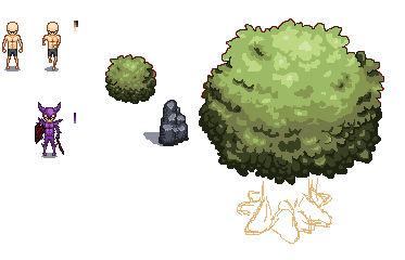
So... i've decided that i'm just not good enough anymore, so in the spirit of self improvement i decided this morning to set 20-40 minutes aside and try to improve my pixel art. i started from scratch on a blank ms paint canvas and after roughly 34 mins this is what i had, for those of you that know me, please tell me, DO these actually look better?
Thanks in adv. | |
Jan 16 2012, 4:26 am
|
|
ImmeasurableHate
|
I like the bush and the rock. And the tree at that. But your base could use a lil more work.
|
Well that was helpful,very descriptive... Try being less vague?
| |
Your base has too many straight lines, no contour. The whole torso is just a straight line. I think that's the worst part. Oh, and he's bow-legged. I like the nature art, though.
| |
He also looks like he doesnt have a neck.
| |
Thanks for the crit Albro was helpfull, but thats the look i was going for.
| |
The tree and rock is what looks very beautiful, shows as if you are a pro. But the base is what you'll have to work on. And sir, would you mind teaching me the way to create a perfect pallete, like you used in the tree and rock!
| |
I honestly couldn't teach you, i just pick the colours as i go along and if they work,i run with it. Lol.
| |
Looks really good
| |
ImmeasurableHate wrote:
He also looks like he doesnt have a neck. That's the perspective. | |
@Cubanbling, i'm glad you like it :)
@Cyberlord84, thanks god somebody understood this... | |
Pros:
Turf is exceptional as usual, and the base is far superior to anything i could do, and that is a nice shield. Cons: I don't really like purple as much as you. | |
The base icon looks weird to me, the others icons are pretty cool :P Good luck
| |
your good at making evironmental obj icon. Improve on mob iconing skill.
| |
Cyberlord84 wrote:
ImmeasurableHate wrote: The perspective isn't consistent. The head is drawn like you're looking down at quite an angle on the mob, but the rest of the body is drawn like you're looking at it straight on. It looks like the person is tucking their chin down to show you the top of their head. | |
Forum_account wrote:
Cyberlord84 wrote: | |
Your environment art is fantastic as usual but the base is off, not the entire thing just the head, its overly large and the eyes could use being moved up a pixel or 2
| |
Neat! I do have to agree with F_A that the perspective in the base isnt consistent.
For one the torso is abit too long.http://i41.tinypic.com/29m54xk.png That's a good reference to take into account(art by Tor Crowley) the Tree looks fantastic but i can see its still a WIP so ill wait until that's finished to give you critique | |
I tried a few edits of the base, tell me what you guys think.
http://i27.photobucket.com/albums/c193/King-manga-man/ edit-2.png and thanks for the crit so far. | |