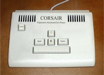
On a related note:

RRRRRRRRRRR!
ID:13446
Jun 8 2006, 2:37 am (Edited on Sep 19 2007, 10:41 am)
|
|
I decided to go with a terminal feel to the blog posts. I just wish I could remove those lines below the header and above the slugline.
On a related note:  RRRRRRRRRRR! | |
I lined up the margin on the textbox with the rest of the contents of the box, so it's all terminaly now.
I don't suppose there's any CSS method to change the value of an input box? I'd like to make the "Save" button say "Process", or something like that. | |
There's is a way, but it's a bit silly:
#add_comment_box input {background-image: url(http://members.byond.com/MobiusEvalon/files/Process.PNG); font-size: 0%;width: 75px;height: 35px;} Just change the image to one that says "Process" and then set the width and height accordingly. Here is an example of how it would turn out. Nice CSS so far also :) | |
The comment display is kinda supposed to look like an incoming message from some important organization or something, with the incoming headline at the left and information text tabbed in a bit. It'll need to be that way anyways, cause I'm going to join all the post and comment boxes together into one big terminal dealy pretty soon.
[Edit]I made all the links within the posts and comments a strike-though on display and a line above and below on hover. I think it looks pretty cool =d There seems to be a large space at the bottom of the posts div though... | |
Eh. I'm not sure I like having all the links crossed out. Maybe if you reversed the normal link and the hover styles, so it gets crossed out when you hover.
Comment box is awesome now. :-) | |
.post .slugline,
.comment .slugline,
.post .title,
.comment .title
{ border:none }
I like this comment entry box! It's pretty snazzy without its border. You might think about making the textbox wider so that there's less of an apparent margin on it. That would make it even better.
Good background image too, it's much more tasteful that the usual, uh, extravaganza that certain people indulge in... naming no names..