http://imgur.com/a/7Dtrh#0


Preview
ID:1347660
Aug 8 2013, 4:24 am (Edited on Aug 8 2013, 9:06 am)
|
|
Hey guys, I spent some time and whipped up some new stars. BYOND can use them if they like, as a replacement for the current stars.
http://imgur.com/a/7Dtrh#0 Preview | |
Aug 8 2013, 4:28 am
|
|
Stephen001
|
I personally want them to look like military decorations, such that I can expect plenty of http://i3.kym-cdn.com/photos/images/original/000/149/678/ 131091292545.jpg on the forums.
|
Hah. That'd be neat. I don't have the time to work something like that out currently, maybe someone else can try their hand at it.
| |
I don't really want military decorations, to be clear. Maybe something like the icons that ... someone, I forget, drew up, where money ones had a little money symbol etc.
| |
For my own two cents on the design of the stars is that I think we should try for some kind of visual cohesion in the graphics used on the site.
And since BYOND's most prominent graphic is our beloved atom, then I think that other site graphics should look like they "belong" with it. Not necessarily a bunch of alternately colored atoms, but at least coordinated in style/look (a nice, but subtle 3D shading, a white border without harsh black outlining, perhaps a matching drop-shadow, etc.) | |
That's the guy.
| |
These.. doesn't really look that good. The current stars are much more visually appealing.
| |
Really? These turned out to be a bit 'softer' than I had in mind, but the shading at least is something I prefer. I have to admit, they don't look very good against imgur's background.
Since the forum's scheme is gray, I kept the contrast a little bit lower, and held off on a really prominent outline. There's a test of them against the forum colors. | |
The problem I have with them is that they're not shaped quite right for stars. They're more starfish shaped...lol
To me, a star needs to have straight edges, sharp points, and the two "arms" at the sides need to stick out a little closer to horizontal. Like these:  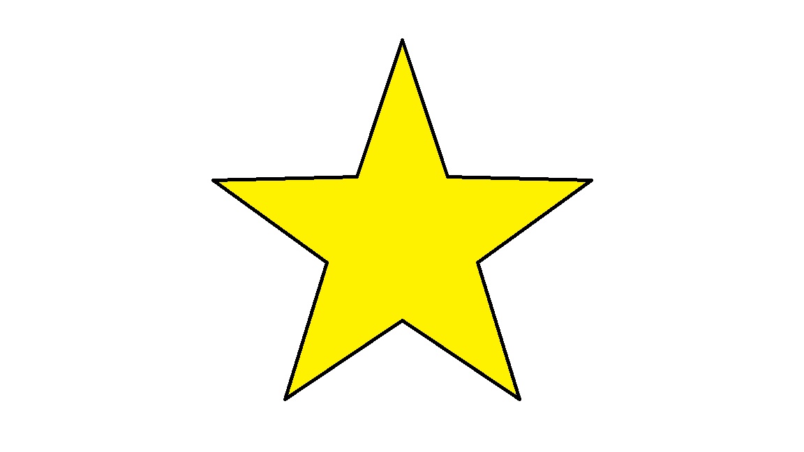 But not like these:    :) | |
Haha. Indeed. I had a hard time getting a proper shape at 32x32, so I just rounded it off a bit. Perhaps someone could finish the job and bring them more to a point.
| |
Stars are pretty difficult at a small pixel-size. And to get a good one, you need to do a lot of anti-aliasing work.
Here's what the current star looks like in the DM editor:  There's a ton of AA. Of course, what is more likely is that they were originally drawn at a much higher size (probably as vector drawings), and shrunk down to their current size with a resizing option that did most of the anti-aliasing automatically. | |
Yup. Theres some anti-aliasing on what I did as well, just.. to a smaller degree. The thing that bothers me about the current stars are the outlines and the lighting. I'm not a big fan of black outlines, I prefer outlines to be a darker version of the color it contains, which is what I learned in Graphic Design college.
The lighting just feels.. bleh. I dunno. The graphic just doesn't do it for me. | |
Stars just don't do it.. they look cheap and way out of place.. especially being so large two of them are the same width as an avatar, they draw attention to themselves and not much else.
Each time I open a post the first thing I see is unprofessional ugly stars... (sorry LummoxJr) | |
I have to admit, the pillow shading just doesn't look good. I could understand if the stars were glowing, but for that to happen they would need to get lighter towards the outside, instead of getting darker.
Anyway, I tried to make some stars myself. It's kind of hard to work with such a small icon size. These are more like regular or "perfect" shape stars. I gave them a 3D bevel, since I think that's the only proper way to "shade" a star. They seem to have turned out better than the current ones at least.  What do you think? | |
Since BYOND is all about games why can't we have shields swords and other things like trolls for the trolls..
| |
On that note I am willing to pay a pixel artist $10 for some new forum icons that aren't stars and for in well with the website, once the artist has displayed the icons, everyone agrees and Tom implements them they will get the $$...
Price may increase to the cost of a membership. | |
These definitely have that crisp, clear line shape that I excluded from my set, although they appear a bit too.. sharp, for a forum, that's what I think when I see them.
I'm starting to agree with other ideas about these icons, perhaps more personal graphics would be ideal. This would definitely call for some kind of poll though, it seems like ideas about how they should look are different person to person. | |
I thought mine was looking cool, until I resized it....
 | |