Nov 24 2014, 9:03 am
|
|
Ganite
|
I agree with EG. But then again he was given the Dragon ball by me and I forgot who made it for me (a year ago). So he doesn't want to touch someone else's art. UPD4T3 made this for me free even if it simple or not the best he didn't have to make me anything. But I agree it would be better as a vector image indeed but you gotta take what you can get for free!
|
I'm trying to wrap my head around why any real human would ever think that for a game that does not publicly express a desire to look like indie game 16234 with the low pixel art.
You're going to sit here and tell me when you see a 2D game advertised, something that you know actually gets promo ads and articles, the logo slapped on the advertisements looks as jaggy? Now sure, if we look hard enough we can see some blurs, but let's hope we don't see clear cut jagged edges UNLESS the logo is displayed in the game ala a GBA game. It's all up to the art direction of the game of course, but come the fuck on, how can anyone think what you just said? | |
Also by the way if you noticed screenshots where deleted from the HUB. All art is being done even down to the logo. Thanks to the new artist. Since gold has been MIA going on 4 weeks now.
| |
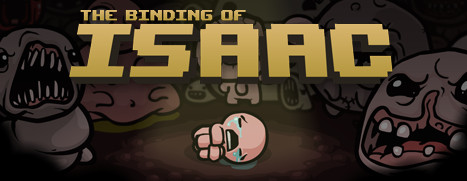
Samurai Gunn promo image
Elliot Quest promo image Bind of Isaac promo image I think I may have worded myself poorly. I didn't mean that you should lower the quality of the typeface because the art style is pixel art or that there were no issues with the Dragonball, I just meant that it should match the style of the game. Why would you use a vector image to represent a pixel art game? E: Although on closer inspection, the image I linked for tBoI actually looks to be vector with an intentional "pixel art" effect on the text... kind of the opposite of what we're talking about. :p | |
You can use vector art to look pixel. Look at that Binding of Isaac logo. The type can be vectortized, and just put on that gradient and boom. Elliot Quest, would take some time, but that could be made vector as well and still look good.
Samurai however, is EXACTLY what I was talking about when I mentioned indie game 16000+ somethingwhatever, it's that "low pixel" looking shit that has been too over done. Maybe you don't understand what I mean when I say vector. What do you even think about when that hits your mind? You realise vector is the literal objectively superior format for logos right? I mean you don't actually slap these things things together in Photoshop or fireworks, or MS paint unless you want something you can never perfectly scale or properly print on anything. Samurai would take some time, but even that can be made vector. Sure although it was stated the logo was being redone, keep your literal pixel shit Dragon ball, go select it and then resize it up and down and tell me how that works out for you, probably pretty shit. You can mimic a pixel style all you want using vectors because you get a much better result. But round that fucking dragon ball out man. | |
I'm pretty sure it's unintentional, but your tone is coming off a bit hostile and it's somewhat disconcerting.
Yeah, I know what vector art is. I can definitely see the advantages to it when making different images at different resolutions. If it were me, though, I would probably just do different versions for different resolutions instead to maintain authenticity. I guess at this point it really comes down to a matter of opinion, which is subjective by definition. PS. That gradient in BoI is ugly af. lol | |
I think it looks alright for what it is. I agree it should be vectored, but I wasn't going out of my way to create my own Dragonball so I used resources that were given to me and attempted (lazily, my apologies) to match what was given.
I am thankful for the critique though, and will produce more quality work. | |
Tomorrow watch out for a Pre-Alpha test server to test out the combat & login mechanics of the game.
New HUB: http://www.byond.com/games/Ganite/ChronicleZ | |