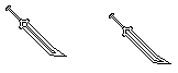
Example of regular sword.

Attempt at making a curved sword
and
------

-------

What i tried to accomplish is to have the end of the blade start to curve when it reaches the tip, but it never looks right to me can anyone help :c?
ID:1947775
Sep 23 2015, 7:16 am (Edited on Sep 23 2015, 7:43 am)
|
|
I'm no good at pixel art whatsoever, and my attempts usually just fail completely so i attempt to make some of the most basic things swords, but i can't seem to get the curve in a certain type of sword im trying to make it never actually look very good.
Example of regular sword. Attempt at making a curved sword and ------ ------- What i tried to accomplish is to have the end of the blade start to curve when it reaches the tip, but it never looks right to me can anyone help :c? | |
That looks nice :O. i might try it, though im not sure how far im going to go with it xD. I should probably color it to :/.
| |
Yeah it is just simple shading. :) Start dark and go to lighter shades in the same range of color/spectrum/etc.
| |
What if i want the blade to be black O-O?
| |
Same process, just use shades of light black to dark black.
Black and White are Shades and not colors, thus they have a multitude of different levels of darkness they can make. Basically just use gray, black-gray, darker black-gray and then black. | |
 *vanishes* | |
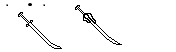
drew over your bottom-most right outline. antialiasing is hard.
  As far as curve shapes go, I tend to think of it in terms of the outside edge and the inside edge. It's generally easier to create a satisfying curved shape if these two edges are not very close to eachother. Additionally, the two curves should not be approximately parallel, because then you get a weird jagged stair effect going on. If your style permits, antialiasing helps a lot. | |
 The biggest issue is the perspective hindering the curve itself but with a bit of trickery or different placement you could get a decent looking curve to stand out that someone has a "Katana" or "Curved Blade" over a normal straight edge sword. Though the way you go about it also depends on if you're making say a Weapon Icon or a Weapon Overlay. | |
D4RK3 54B3R wrote:
drew over your bottom-most right outline. antialiasing is hard. Uhh i don't really understand :c. | |
Look up what a Tangent is and also do some research into Katana's. A tangent isn't exactly the right thing but it shows you an example of how the flat portion of a curve can align with a flat line.
Basically, like I said in my post above, you want to put the kink in the handle and not the blade. Like the person you quoted mentioned, if you want to curve it, the tip and the hilt cannot be parallel (evenly aligned) or it will look weird. | |
 My katana looks terrible :/. Edit: Though originally i wasnt actually trying to make a katana more like a cutlass, but katanas could probably work to :c. | |
It isn't so bad, it has more of a curve than mine! It is all about using the shading to make it appear not as jagged as it is.
Try expanding it outward, two, maybe three pixels across the blade and you do this by filling the outside jagged edges until they look proper and then coloring in the inside. | |
Enderdragon wrote:
Drew over your outline again.   Your line art is mostly good here. AER is right in that your blade overall needs to be a bit thicker. After making it thicker, your line art has the potential to look great once filled in. | |
Thanks for the feed back :D i'll try again though i'm not very good with colors, and shades and such :/.
| |
The only way to get better is by doing...and doing...and then doing some more! :) Tired of doing it? Do it even more! That is when you get well enough at it that it comes as second nature.
Nice job on the icon too, dark, although the handle seems to remind me of more of a kitchen knife than a katana (usually katana handles are wrapped with cordage and don't have a handle such as a steak knife as in the image). :) | |
Git gud kid.
| |
Or post on the forum and have someone do it for you as "learning".
| |
They look fine to me except for the last one on the bottom left. I have given out my japanese weapon art before so I don't mind showing you an example:
Here is a Katana that I made for Pondera.
Now, I'm not going to say this is a perfect example of a katana made with pixels, we all have our own art styles. Notice how the spine of the blade itself isn't what is curving, which allows the eye to focus on the blade edge itself, which is curved. There is a kink near the handle instead of in the blade, and if you notice the tip of the blade lines up with the hilt of the handle, like a real katana is intended. This is just my example, learn from it what you can (And give credits if you so choose!). :)