Its an actually base for player icon, im a coder but i dont have time to beg ppl for icons so now im coder and iconner.
I know it look terrible but well its better than nothing, i would like you to tell me what would you change in it. Oh btw the animation is on the way ;).
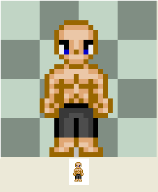
http://img512.imageshack.us/img512/7826/aaadg8.jpg
Edit:
http://img150.imageshack.us/img150/5193/beztytuuyv9.jpg
Animation is done too :p
ID:257926
Nov 28 2007, 11:57 am
|
|
Nov 28 2007, 4:32 pm
|
|
Javster
|
needs alot of work! ><
|
Such as?
Yeah, actually TELL people what they need to improve if you're going to say stuff like that. I shall crit later, for as of now I need to finish my English paper. | |
Javster wrote:
needs alot of work! >< ehh.. I know i need to change a lot in it but i dont know where to start, what colours should i use.. thats why i've posted it here. | |
The arms are disproportionate to the entire body. But it may be the fact that the torso area has more emphasis than the rest of the body. Either make your torso shorter or your legs longer. Also the pillow shading of it should have more of a contrast. Look at the shading of your pants and look at how light the skin is -- it looks very contradicting. Also place more emphasis on the feet; it looks like he's walking around on stubs (there's some Silent Hill freaky stuff for ya :D)!
| |
Asguard wrote:
The arms are disproportionate to the entire body. But it may be the fact that the torso area has more emphasis than the rest of the body. Either make your torso shorter or your legs longer. Also the pillow shading of it should have more of a contrast. Look at the shading of your pants and look at how light the skin is -- it looks very contradicting. Also place more emphasis on the feet; it looks like he's walking around on stubs (there's some Silent Hill freaky stuff for ya :D)! This icon would fit very good in SH, its so ugly that it can scare ppl :D. Anyway soon i will edit this post and show ya new version of this icon. Any idea how can i show whole animation? (i know i can copy and past it in pain but if there's shorter way to do it please tell me :) ) edit http://img527.imageshack.us/img527/4937/beztytuujp2.png ive made the torso higher (+1y) and leg's(+1) recolored as you suggested | |
Duni wrote:
Javster wrote: my bad, i forgot to edit my post.. when i tried to comment the things that needed fixing my internet had cut off and i got mad and just turned off my PC, forgot about this. i'll help ya' post what you need fixing in a few. once again, sorry. | |
My version..
Link-http://i74.photobucket.com/albums/i279/Javster123/ icon_base.png Image- i'll post the Back&Sides sometime Sunday. | |