ID:258920
Sep 7 2010, 11:51 am
|
|
| |
Sep 7 2010, 12:23 pm
|
|
Akto
|
That is an awesome setup.
|
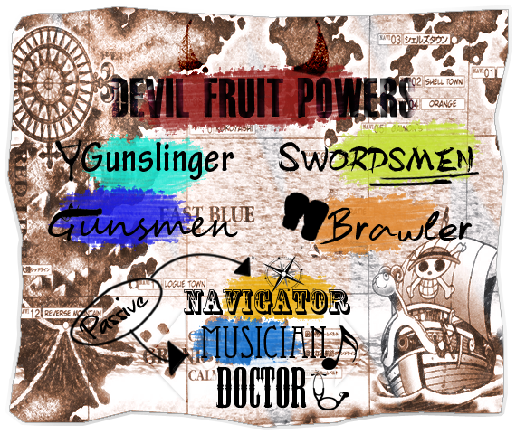
This looks pretty epic, the only thing I would be take the colors away(The ones behind the classes).
| |
I love it. Seems piratey, save for the colors. However, it's swordsman/gunman, replace the e's in men with a's. ;D
| |
Singular wrote:
I love it. Seems piratey, save for the colors. However, it's swordsman/gunman, replace the e's in men with a's. ;D Men is gender-friendly. EDIT: Made the colors more painted like;  | |
I'm not much of fan of the colors, or the text. They just don't match at all with the background image, I assume you were going for a sort of faded treasure map look? I'm trying to think of something that would make it work, but nothing is coming to mind right now. I'd at least do something with the text. Maybe give them an outline of those colors instead having those splotches?
Maybe make the whole thing a bit more structured and consistent as well. Same font, line up the text better, work on the class symbols. I'd maybe redo the background using a light brown instead of a grey'd out brown. Change the color of the passive and circle 'n stuff to maybe like red to make it stand out. On an unrelated note: I assume you're using Brawler to describing a fighting style like Luffy, right? Hehe, Me and my friend came up with the same thing years ago back when we were planning our One Piece game. Ah, maybe I should return to that one day and actually do it. | |
Maggeh wrote:
I'm not much of fan of the colors, or the text. They just don't match at all with the background image, I assume you were going for a sort of faded treasure map look? I'm trying to think of something that would make it work, but nothing is coming to mind right now. I'd at least do something with the text. Maybe give them an outline of those colors instead having those splotches? Text & Colors: I tried to do kind of a text-to-class correlation; connect them if you will. Same goes for the colors, basically. But I do see what everyone means now, the only one that it suits is the "Devil Fruit Powers". Background: It's on a default Purple to Orange, not sure why, but it is lol. | |