He wanted me to post it here (because he isn't a member). So post what you think.
Click here.
ID:28515
Mar 18 2007, 11:38 am
|
|
Mar 18 2007, 12:06 pm
|
|
Elation
|
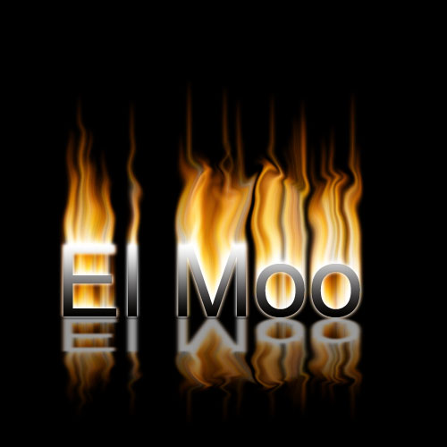
The bit near the bottom looks pretty, but as the flames go up, they start to look less good. Maybe a bit of tweaking is needed?
|
Yeah, I agree with Elly, the Flames look less like flames as the flames go up(if that makes sense to anyone).
| |
It's very apparent that the flames are just smudges on the 2 o's on Moo, and on the M, it looks alright until you get to the top.
The L and E look perfect though. | |
Nice.
| |