ID:67858
 
A while back I post a couple of screenshots comparing the look of the current public version to the coming update to show off some of the graphical upgrading that's been done... Recently, I may have mentioned that I'm taking some more comparison shots to old caps...

Well, I have a few, and I wanted to share some of them now (note: for some silly reason, I arranged all of these backwards from convention, with the new/after shot on the left, and the old/before shot on the right):


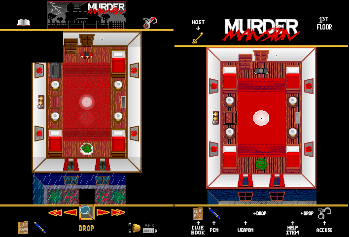
These two sets show a bedroom... First, in full light, and then with a player sleeping with just a lamp turned on (note that normally, when you go to sleep, your screen blacks out... I had to temporarily disable that to get the sleeping shots) I like how much more depth the new look seems to have compared to the old one... Of course, all of the old shots suffer from poor color reduction, so they don't really look quite as nice as the actual game, but they're not far off) The sleeping shot really shows off how much difference a transparent darkness effect makes over the old dither...


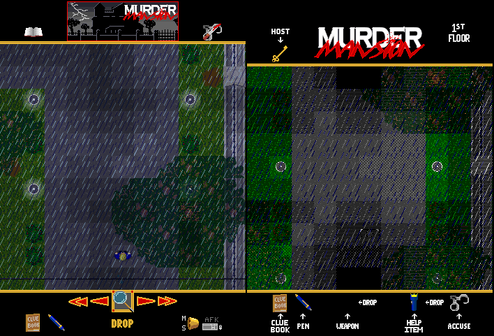
Nothing special here, just an outside shot to show the new rain a bit better (and again, how much nicer things look with transparent darkness)


The old "flashlight-in-the-hallway" shot... I've always really liked how the flashlight effect looks (would be nicer if the light pool was more rounded, but I can live with it this way), and (yes, once again) it looks so much cooler without dithered darkness (note: I'm not claiming personal credit on how nice the transparent darkness looks, since that graphical improvement has virtually nothing to do with my own talent or even my own work, aside from implementing it... I'm just impressed by how much of a difference it makes)


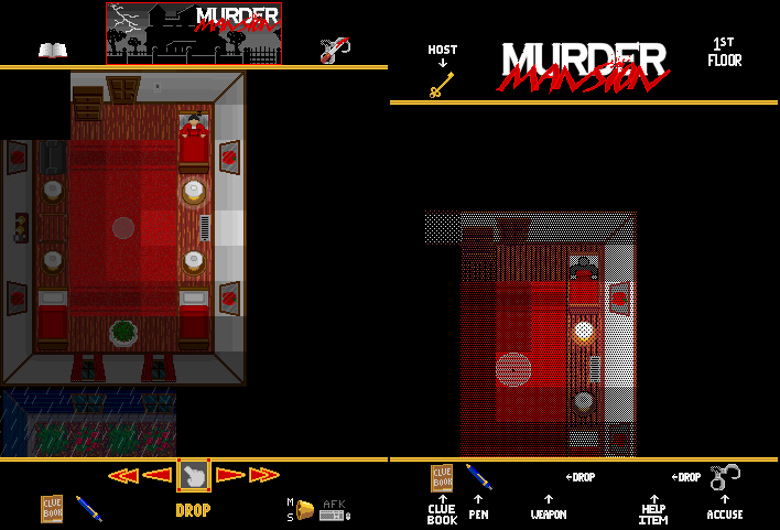
A shot of me standing in the study... This one shows the better graphical depth of the edited icons... The floor has been pushed down, the furniture has been pulled up, etc. The color saturation is also a good deal lower on many graphics, getting away from a more cartoony look...


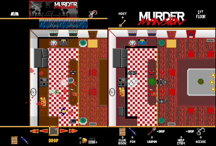
Ahh, the classic "gruesome death by shovel" shot (well, as close an approximation as I took the effort to get) There's a little more variation in the blood splatter icons, not to mention pixel offsets, rotations, etc. to add even further variation... In the new shot, you'll also notice a little magnifying glass icon over one of the blood splatters... As an effort to give a bit more of a visual impact/feedback to actions, any interactions on the map briefly overlay the icon of your Current Action on the object you are interacting with (an attack will flash your weapon's icon onto your victim, examining something flashes the magnifying glass onto that item, etc.) That magnifying glass actually belongs to another mob, who happened to be coming up on the scene (just out of frame for this shot), and was "investigating" the crime scene clues...

That's all for now, hope you like them!

P.S. Expect to get your hands on this update very, very soon...
I love it, everything except for those arrow icons. I hate those!

That's my only beef with your interface. But I always loved this game.
Cool!
Interesting!
The Naked Ninja wrote:
I love it, everything except for those arrow icons. I hate those!

That's my only beef with your interface. But I always loved this game.

They've actually sort of felt off to me, too, ever since I first drew them (I've just never gotten around to figuring out what exactly it is I don't like about them, or how best to fix it)

I guess it basically feels like they don't match the style of everything else, right?

I can't quite put my finger on what gives them that feeling, though... Are they too bright? Are they too prominent due to the border? Do they look too, ummm, "electronic"? Should they be all red? Darker red? All "gold"? Gray? Sky Blue (lol)?

I guess I'll just tinker with them...
The lighting looks so much better, and the cleanup you did on a lot of the icons really looks great... but. :(

The arrow selection just don't feel as intuitive to me compared to the current version of Murder Mansion. When you first released the test version of MM (how long ago was that?) with the arrows I just absolutely hated how weapon and help items were combined. (maybe it's because I'm just so used to the current version?)

I hope you can find it within yourself to make a compatible interface in the same vein as the current one, or provide us with some sort of macro to change items/actions? =(

Still looking forward to it though, one of my favorite BYOND games.

SuperSaiyanGokuX wrote:
The Naked Ninja wrote:
I love it, everything except for those arrow icons. I hate those!

That's my only beef with your interface. But I always loved this game.

They've actually sort of felt off to me, too, ever since I first drew them (I've just never gotten around to figuring out what exactly it is I don't like about them, or how best to fix it)

I guess it basically feels like they don't match the style of everything else, right?

I can't quite put my finger on what gives them that feeling, though... Are they too bright? Are they too prominent due to the border? Do they look too, ummm, "electronic"? Should they be all red? Darker red? All "gold"? Gray? Sky Blue (lol)?

I guess I'll just tinker with them...

A few others dislike the switch to the new item interface as well, so don't feel bad (I suspect it is mostly because it's just such a big change from what everyone's used to)

My reasons for making the change are the following:

In order to allow all players to interact with objects and other players in more than one way (IE, an armed murderer could only attack another player; they couldn't "look at" them, or anything else), to give the players a few more ways to interact with things (crash through windows, knock on doors, examine anything, including spawners, etc.), to give players a way to temporarily move at full "run" speed (in the original, everyone moves at full speed, but I wanted to add a default movement delay to help get rid of the action game/fast-twitch feel MM had, but at the same time, I didn't want to lock everyone into walking speed 100% of the time), and to give players their own built-in attack (so unarmed victims can still defend themselves) I decided on giving players the set of built-in Player Abilities in addition to the usual weapons and items...

But then I needed a way to handle these new abilities...

One way would be to add more HUD buttons (one to toggle run on and off, one to switch from attack mode to examine/operate mode, etc.) but this seemed messy and clumsy...

Another method I tossed around was to add a "hand" system (instead of the two item slots, you'd have a left and right hand, which could hold whatever items you pick up, or be switched to other functions, with maybe some sort of "pocket" to store unused items in to keep your hand(s) free) This one seemed pretty promising, but I still kept running into issues with it...

And, my final idea (the one I went with) was to put all of the actions into a list to scroll through, so your next click would perform that action...

Now, I could just stick these actions off to the side, next to the existing weapon and help items, but again, that would be cluttered and clumsy, and since weapons and items basically operate the same as the player abilities (you apply the effects of that object to whatever/whoever you click on), it just made more sense to stick them all together into one single system...

And so, the Current Action selection control was born...
I actually think it's more intuitive than the old system... What could be simpler than knowing that whatever you have selected in the slot will be the action you take against anything you click on? (of course, some interactions do nothing; like clicking on a lamp with a knife selected)

And since there's really never any need to be doing two things at once (heck, the game generally doesn't even allow two actions to be performed at once; you can't even move once you've made an attack until that attack is over), and honestly there are very few situations where you need to do a fast switch from one task to another (again, the focus of the game is not to be an action game; at least, not until DeathMatch mode was added...lol), it's been my opinion that the little bit that this system might slow people down is actually a good thing...lol

But even so, once you're used to it, I think it'll become second-nature, and it won't slow anyone down at all...

But anyways, I've still listened to the people, and added in ways to speed it up with the skip to first and last item buttons, and a set of key macros for the functions "CycleBegin", "CycleLeft", "CycleRight", and "CycleEnd" (which are hidden verbs, so players can even set up their own keys to use them if they don't like the ones I set up)

[Edit:] Oh, the macros that I set up for those functions are:

Delete/NorthEast=CycleLeft
PageDown/SouthEast=CycleRight
Home/NorthWest=CycleBegin
End/SouthWest=CycleEnd

(The diagonal directions were unintended... I was thinking of the set of keys above the arrow keys when I picked the keys to use, and not the set on the numpad, which obviously correspond to those directions, but it shouldn't be a big problem, since diagonal movement is disabled, anyway)