

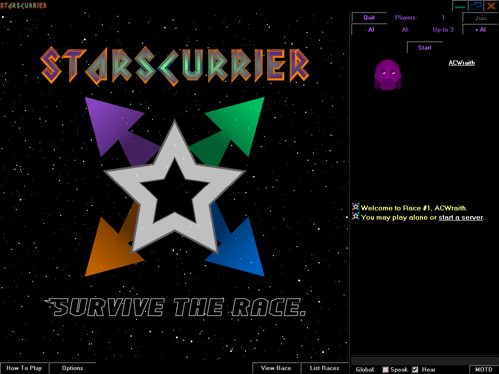
Each race requires a map so I went ahead and created a big logo.

Once the game begins, a tip button can be found in the score panel. It opens a window that describes details of the interface. Normally, I like to leave this text out because a good interface should make it obvious. However, selecting sectors on the map results in different outcomes depending on the phase.
During the Move & Hire phase, players will see arrows if using energy to travel or a giant Mind Rifter icon if teleporting. (Mind Rifters are a type of psychic worker that can be placed.) Also note the small, dark, ship-shaped beacons that mark where players have traveled. A player will have completed a lap when every sector contains one of their beacons.

Players will also be able to use the Move & Hire phase to place workers in their current sector by spending contracts. Those hired prior to this phase must remain where they are. As with ship inventories and stationed workers, the input is arranged in a grid that matches the map.
Unfortunately, I don't have the Trade phase implemented yet so no contracts have been bought in this picture. (It's also from a separate game so another map was generated.)
At any point during the game, a button inside the score pane allows people to view the hostility of the Turret Gunners. (They're workers that damage opposing ships entering their sector.) From this table, players have access to buttons that toggle how their Gunners treat each opponent.
BANG!
...I don't have any sound effects yet.
Just one suggestion: the font you're using for the tips (the one that looks Greek) makes my eyes wobble. It's readable, but I wouldn't say it's "scan-able," as in you can't glance at it and identify its key point (or even that it's text :P).