ID:116984
 
Keywords: art, gender, sociology
Here is a comic featuring three stick figures:


Source: xkcd


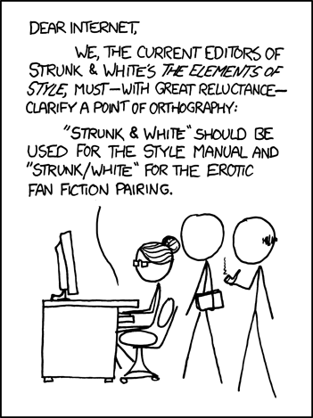
The one on the left is a woman, marked as such by a hairstyle associated with women. Less conclusively, she also has glasses that look like "librarian/granny style" glasses... another feminine trait.

The one on the right is a man, marked as such by a hairstyle (such as it is) associated with men. Like the glasses on the woman, he's holding a pipe... another tangential marker of manhood.

So what about the figure in the middle? When you saw the image, did you experience a moment of puzzlement? There are no indicators of hair, no gendered accessories... just a blank canvas in a stylized human shape, holding a book.

Once you've read the text and figured out what the tableau represents, you might assume that it's a man and the two gentlemen are Messrs. Strunk and White themselves... but chances are you didn't have to read the text for your brain to code both of the standing figures as male.

According to the conventions of xkcd and the larger societal conventions from which it's derived, we are expected to (and indeed, will) recognize the unmarked figure as male. What tells us that it is a male figure, exactly? The absence of anything marking it as female.

When we see a figure representing the human form standing in for a particular person, we're supposed to assume that anything not "marked" on it, anything not defined, is at the "default setting".

(There is an odd permutation of this default effect here, wherein the figure on the right has a tiny bit of hair to mark the fact that he's bald. The figure in the middle has no such marking, which means we're to understand that it has the "normal" amount of hair... essentially, Randall Munroe drew a bit of hair on one figure to show that it has less hair than the one figure he didn't draw any on. Weird, huh?)

Now, there are some very specific contexts in which human gender defaults to "female". I referenced one of these above when I mentioned librarians. Teachers, in most cases. Flight attendants. Nurses, except perhaps to fans of the current run of Doctor Who.

To invoke the object-oriented architecture of BYOND:

mob
gender="male"
woman
gender="female"


People are male; women are a special case of people and must be declared.

What does this mean for people designing and playing games on BYOND? It means that a 32x32 (or similar sized icon) that conveys little more than the presence of a face, hair, and the standard arrangement of limbs is always going to have a muuuuuuuch easier job portraying "masculinity", the idea of manhood, the idea that one is looking at a male character, than it will with conveying a female character.

The traditional male body has secondary sexual markers every bit as distinct from an androgynous figure's as a woman's breasts and hips, but just like the "normal length hair" that Munroe didn't need to draw on the middle figure, no icon needs to show muscle development or body hair. Manliness is assumed from the fact that nothing says otherwise.

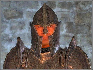
With all that in mind, here's part of a screen shot from RetroQuest:


Is that image a man? There's no indication of a typically male hairstyle. There's no stubble or body hair. There's no sign of masculine patterns of muscular development. One could say it is more likely male because it lacks the defining characteristics of a female body shape... but there's nothing especially male about its shape, either. The fact that the absence of femininity is taken as presence of masculinity is just that default in operation.

(As a side note: I specifically picked the weapon and companion based on what I thought would have the strongest "male" associations. It would be interesting to do a study with the same figure holding a bow and accompanied by a cat.)

The base icon is no more explicitly a man than it's a white man, or a right-handed white man, or a right-handed white man who is a shade under six feet tall... but that's how most viewers will tend to read it without even thinking about it even though (with the possible exception of handedness, though that's customizable) none of that is actually marked on it anywhere.

The fact is that the green splotch I'm using to represent PCs isn't particularly male or female. Players will have the opportunity to differentiate their appearance through the use of equipment to a far greater degree than this image shows, but the use of an undifferentiated base icon is my attempt to get people to think a little bit differently about how gender is represented.
.....If I was a member I'd yea this
Very interesting.

I would have to say your figure in your screen shot looks more male than female. Not because he/she is lacking features that would argue otherwise, but because he/she has a broad torso and chest and wide shoulders. His legs are bowed outwards which is another masculine indications as depicted on old westerns and is typically how a middle-aged man is seen.

Well, the dog didn't do much for me to sway my opinion nor did the mase in his/her hand.
I'd have to agree with Yousuke13 here. The waist-to-hip ratio is more similar to that of a man than a woman.

Take a look at these two figures. With a little tweaking you could probably nail down a nice set of androgynous features. It's all in the hips and shoulders.
SuperAntx wrote:
Yousuke13

I see what you did there. Why so mean? :'(
It's 4:30am.
Thanks for illustrating the principle at work. :)

The waist-to-hip ratio is more similar to that of a man than a woman.

Waist and hip? Talk to me about the hair length next! How about the collar on the shirt the figure is wearing?

The figure depicted does not properly have a waist or hips. At this resolution, "waist and hips" are both exactly six pixels wide, a waist-to-hip ratio of 100%. If I knock a pixel off each side, we're suddenly looking at a cartoonish wasp-waist figure with a 66% waist-to-hip.

That's not "androgynous", it's not in between male and female, it's in fact a fairly extreme representation of a typically female characteristic. So the problem of the waist-to-hip ratio being "more similar" to one gender doesn't actually get solved, it just becomes reversed.

The reason this icon looks male to you has nothing to do with ratio and averages and everything to do with visible hips being a "female marker". In the absence of that marker, you see an unmarked human being... and an unmarked human being codes as male.
It's no big secret that, having nothing to identify someone by, we usually default to referring to them as "he". One only has to look at non-gender-neutral languages to see that. However, in this case your icon looks predominantly male, even brutish male (disagree about the waist as you will, but the shape of the head and the thick neck are masculine features - though if I were pressed I could see it as a woman wearing a helmet, I suppose). The leftmost of the icons Antx linked to looks a lot more androgynous to me (I'll admit the rightmost is biased), and I wouldn't be inclined to call it either male or female without context.

edit: A friend points out in German they would default to female, when having nothing to identify someone by.
It's interesting, as some cultures (and languages) fall back to female assumption.
SuperAntX's icons are only more androgynous because they have markers that allow you to see the genderless figure as possibly feminine. That's not actual androgyny. That's taking an unmarked state and adding traits that -might be- feminine in order to overcome the default.

The icon I'm using is "brutish" because it's blocky, and it's blocky because it's so stylized... i.e., ill-defined. There is no waist. There are no hips. There is no neck. That's because I'm using a low resolution, at which only blocky figures (like those in the original versions of the Ultima trilogy) are really possible.

SuperAntX's icons are drawn at a higher resolution that isn't in keeping with this project. Naturally they're better defined, but they'd be completely out of place.

My only choices for a waist-to-hip ratio are 100% (no waist, no hips, no markers) and 66% or lower (definitely female). The thing is that making the hips so definitely female would help some people accept the figure as androgynous, but it really shouldn't.

"Shape of the head" isn't a masculine or feminine characteristic at above the level of archeological examination (looking at the shape of a skull). Believe me, one cannot actually convey a masculine or feminine skull in pixel art of this size. Calling it a male-shaped head is like saying the middle figure in the xkcd strip I referenced has a masculine haircut.
Three people have pointed out your icon has features they find masculine, but you argue they are gender-neutral, and that you cannot convey such things in an icon of this size. When two people provide an example of what they consider an androgynous icon, you argue it has obviously feminine features which influence our perception. Rather than us illustrating the principle of seeing-things-as-masculine-when-they-clearly-aren't, I'm beginning to suspect you're illustrating the principle of 'seeing things in whatever way better fits one's argument'!
Out of general interest I allowed myself to make minimal (and rather poor) modifications to your image. I removed the dog and the flail, and thinned the neck and body a little bit (I don't consider a thick neck and body - a 'blocky' icon - gender-neutral; we culturally associate these traits with masculinity, rather like the round circle is more feminine than a hexagon, with its pointy edges). I'd have also liked to change the color scheme (a black on neon green theme seems rather masculine to me), but I think the result is good enough as is. I consider the following icon rather androgynous, even disregarding the proportional tallness and bulky, spread out arms (we would expect a feminine figure to have her arms closer to her waist - the current icon sports a rather 'menacing', masculine posture):

http://imageshack.us/photo/my-images/847/324hr.jpg/
You're illustrating that principle of seeing what suits your argument best fairly well yourself, in that you conveniently ignore the fact I also said that the added definition in those icons depends on a greater resolution than this project uses.

I can't tell for certain from glancing at your image file if that's true of your modification or not, but I suspect it is.

This project uses base tiles of only 16x16 pixels, blown up in the view screen to 32x32. Mob icons slightly exceed these dimensions so as to "pop out" a bit from the monochrome landscape, but not by enough to allow much fine definition at all.

Again, this is by design.

The figure is blocky because I have chosen to work in a blocky medium, and I don't mean pixel art in general. If all figures in a series are blocky, blockiness itself does not convey gender.

For example, look at the typical restroom signs in use in the U.S. It's the exact same body in each one, but one of them has a skirt/dress.

For another example, look at simple figures made from the same mold like old school Fisher Price "little people". Same highly stylized body shape for men and women, then differentiated through color and accessories.

(a black on neon green theme seems rather masculine to me)

Seriously, what? It's based on one of the more common types of monochrome CRT monitors in private use when I was growing up. I could have gone with black/amber or black/white, and I'm guessing you'd consider either one of those to be more gender neutral but the fact that you're talking about the gender of color when it's not even "what color one person is wearing" but "what color is used to render the whole world" (and the fact that you apparently assign sex to polygons, seriously?) makes me feel pretty comfortable disregarding any advice you give on gender neutral presentations.

the current icon sports a rather 'menacing', masculine posture

While I want this game to have some building/crafting and social elements, at its core it's a game about descending into dungeons and fighting monsters. The figure's arms are positioned so that if a weapon or shield or other implement of war is overlaid on the hand it will look halfway natural.

I'm not contesting with you that a "ready to fight" pose does code as masculine to the average human brain, because it totally does. Since I'm making a game about characters who are in fact "ready to fight" then I can choose to try to blow past that impression or I can capitulate to it. Guess which one I'm going for?

I actually have two different versions of the icon I've switched between, one with a more defined neck and slightly different shoulders. I'm not sure which one I'm going to use, ultimately. The legs are also not finalized.

But a wasp-waist or a less active pose is just not going to happen.

Before you respond again, I want you to do something. Take a look at what you said: the icon as it exists has what you consider to be a male-shaped head, but you could see it as a woman wearing a helmet. Think about that. Think about what you're actually saying there.

Because if I take you literally... that a woman's head is kind of like a man's head without a helmet on, or a man's head is kind of like a woman's head plus a helmet... then what you're saying is ridiculous.

I know you're not actually saying either of those things, though, and that's why I'm comfortable chalking your reaction up to the same default process I've described above. Because you're not actually talking about what men look like and what women look like. You're talking about sociologically codign.
I'll add that instead of making it blocky I could have gone with a stick figure, which probably would have sidestepped a lot of the "But it's too bulky to be a woman!" crap, but I found that accessorizing the stick figure got weird... should I try to make garments/armor that fit the stick, or like there was a body there?

The latter seemed a lot more viable, but then I was left with the same basic thing you see here: when garments are like six pixels across, you get a "blocky" look.
I believe Toadfish was referring to this sort of helmet rather than a hardhat or a modern military helmet. Be it male or female the head doesn't really attach to the torso like that unless you have a really thick, muscular neck; a trait more suited towards men.
Doesn't matter if he meant that or an astronaut helmet or a foam cheesehead helmet from Wisconsin.

The point is, in what way is a woman's head shaped so differently from a man's head that the icon's head can be taken for either a man's head or the head of a woman underneath a helmet?

I can see two ways of taking that.

One is that the icon doesn't have typically female hair. Well, this is the xkcd thing. It doesn't have typically male hair, either. It doesn't have any hair. That reads as "man with short hair". If this is why Toadfish finds it easier to read it as woman when he imagines a helmet, it really illustrates the point, because there are women who wear their hair short... but just as Randall Munroe wouldn't find himself able to depict a short-haired woman without drawing her hair, he doesn't even find that as a comparison when he reaches for ways to make the icon as it exists seem feminine. He imagines she's wearing something that covers her head and obscures the feminine marker (hair).

The other is more of a stretch: a subconscious association between masculine and war-like. He sees the figure as war-like, and therefore masculine... but it could also be a war-like woman, a woman outfitted for war.

Whatever his reaction is caused by, we're still left with the basic fact that a man's head is not a woman's head plus a helmet. He's looking at a four-pixel circle that's been joined to a six pixel body and saying its shape makes it more one gender than another. That's a position that will be common in society, but it's not one that's easily explained or defended.
You're illustrating that principle of seeing what suits your argument best fairly well yourself, in that you conveniently ignore the fact I also said that the added definition in those icons depends on a greater resolution than this project uses.
...
The figure is blocky because I have chosen to work in a blocky medium, and I don't mean pixel art in general. If all figures in a series are blocky, blockiness itself does not convey gender.

I don't understand your argument. The fact an artistic decision forces you to make blocky icons does not make blocky icons less masculine. A circle is more 'feminine'-looking than a hexagon because of its inherent, smooth shape; not because of surrounding context or what have you. Blockiness is a characteristic of a masculine shape, unrelated to context.

For example, look at the typical restroom signs in use in the U.S. It's the exact same body in each one, but one of them has a skirt/dress.

I don't know how clear I made it in my original post, but I don't necessarily disagree with your general point. I'm saying the specific icon you chose to illustrate this in your game is biased.

Seriously, what? It's based on one of the more common types of monochrome CRT monitors in private use when I was growing up. I could have gone with black/amber or black/white, and I'm guessing you'd consider either one of those to be more gender neutral but the fact that you're talking about the gender of color when it's not even "what color one person is wearing" but "what color is used to render the whole world" (and the fact that you apparently assign sex to polygons, seriously?) makes me feel pretty comfortable disregarding any advice you give on gender neutral presentations.

I'm not sure what's so odd about associating shape and color with masculinity (which, by the way, you're being silly if you're actually equating that to assigning 'sex' to them). A circle is has more feminine qualities than a hexagon; a pixel drawing of a woman will be more smooth and rounded than a drawing of a man, which would be more jagged. Ask most people what they consider the more 'masculine' out of a square and an ellipse , and I'll bet they'll answer square. Likewise, if you redraw your game in fluffy pink and white I'll bet that would influence our gender perception of the characters.

While I want this game to have some building/crafting and social elements, at its core it's a game about descending into dungeons and fighting monsters. The figure's arms are positioned so that if a weapon or shield or other implement of war is overlaid on the hand it will look halfway natural.

Adventuring and crafting is a masculine activity, which of course would influence our gender perception of the characters, just like a 'nurse' is by default female. I'm not telling you to change that - I'm just saying you can hardly draw conclusions about sociological conditioning from the 16x16 undetailed drawing of an adventurer in battle-ready pose.

Before you respond again, I want you to do something. Take a look at what you said: the icon as it exists has what you consider to be a male-shaped head, but you could see it as a woman wearing a helmet. Think about that. Think about what you're actually saying there.

I was referring to the helmet Antx linked to (well, a slightly different one, but that's the general direction). A woman's head is usually rounder and smaller than a man's head, and the neck is usually less stiff.
He's looking at a four-pixel circle that's been joined to a six pixel body and saying its shape makes it more one gender than another. That's a position that will be common in society, but it's not one that's easily explained or defended.

Draw a circle and three lines in it. Do you see a face? As people with imagination we will always see a lot more in an image than what is actually present. We will also always extrapolate small details when the drawing is abstract enough to allow for that, in which case we will rely on our cultural background. The fact is we are culturally/sociologically conditioned to 'extrapolate' certain shapes as masculine, and others as feminine. Is this behaviour much harder to defend than seeing a face in the aforementioned circle?
AlexandraErin wrote:
The point is, in what way is a woman's head shaped so differently from a man's head that the icon's head can be taken for either a man's head or the head of a woman underneath a helmet?

I think there's been a misunderstand. What I'm getting at is the head of your icon has the head fused with the neck. Either your character is wearing a helmet like the one I linked earlier or he has a big, meaty neck which is a male trait. If it's the latter then it means your icon isn't actually gender-neutral, it's a big, burly guy.

He's looking at a four-pixel circle that's been joined to a six pixel body and saying its shape makes it more one gender than another.

Four pixels can make a world of difference.
Blocky icons aren't masculine. You can't show me a man shaped like that. But blocky figures are just not that good at conveying femininity, and in the absence of femininity the default assumption holds.

That's why we read the "male" restroom icon as a man and not a woman who's wearing pants.

When nobody points this out or asks people to think about it... we don't think about it. We just take the figure as masculine.

When it is pointed out, the rationalization starts because no one likes to themselves as a receptacle for irrational social programming.

We'll never prove this without a time machine or a portal to a parallel universe, but I'll bet if I'd started with a figure that had a four-pixel waste and thinner arms and shoulders and presented that as my gender neutral icon I'd have people (possibly some of the same people!) telling me it's too feminine to stand in for the sort of male figure that might be swinging broadswords around.

A circle is more 'feminine'-looking than a hexagon because of its inherent, smooth shape

No freaking comment. I just want to highlight that.

I was referring to the helmet Antx linked to (well, a slightly different one, but that's the general direction). A woman's head is usually rounder and smaller than a man's head, and the neck is usually less stiff.

You would have a valid-ish point if you were saying it looks like an icon of a person wearing a helmet (because it really kind of does; for that reason alone I might give it a defined neck even though I'm not keen on the "pencil-neck" look it gives the icon), rather than saying you could see it as a man or maybe a woman wearing a helmet.

The difference in a man's head and neck and a woman's is not anywhere near large enough that needs to be apparent at that scale/resolution/level of difference.

I'm not sure what's so odd about associating shape and color with masculinity

Quite a bit. On what level is it a reasonable thing to do as a society, to think that polygons are male and circles are female, or that pink makes something for girls? How does it make sense? The really odd thing is that we don't notice how odd it is more often, and how defensive we tend to become when somebody goes, "Wait... what? No, seriously. What?" about it.

I'm not making this little hobby game in the expectation of tearing the whole thing down somehow, but being aware of the system I have a choice to go along with it completely or subvert it a bit, and I'm choosing to subvert it a bit.

And seriously, calling the game's CRT approximation "masculine" is as clear an example of "default = male" that I could hope for.

If I washed the game in pink or lavender it would come out as being "a girl thing", but it's hard to be more gender neutral than making everything an approximation of old school phosphor green. Green is not explicitly held to be a "manly" color. It's not the traditional color for differentiating boys in our society (blue). It has no strong explicit gender connotations at all.

And yet it reads to you as masculine. Why? If you can give me a reason that doesn't boil down to "green is a boy color because it's not a girl color", I'll be surprised.
Page: 1 2 3