 <--Original
 <--Remake
Comment/Critique Please.
ID:21083
Oct 17 2006, 3:42 pm
|
|
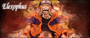
Well, my last Naruto sig was pretty much a test of a new style. I mesed around a bit, and here is the complete remake:
<--Original <--RemakeComment/Critique Please. | |
The white on the sides is suppose to be lightning...lol
| |
Heh, Ryo, believe it or not, I've only been "attempting" GFX for about 5 months. Just get Photoshop and find some tut's to learn the basics. Ten see what you can do on your own, and improve. Thanks for your always positive comments.
| |
Yo Elezophus nice Naruto picture it looks really cool...
| |
He didn't make the picture, stop giving him credit for the drawing/picture itself.
| |
PS:Give credit to this artist.
http://www.deviantart.com/deviation/ 15721808/?qo=171&q=Naruto&qh=boost%3Apopular+age_sigma%3A24h +age_scale%3A5 | |
Well the no offense, but thats a horrible lightning effect.
| |
CodingSkillz2 wrote:
PS:Give credit to this artist. He's right. I didn't "draw" the render I used. I just found it. But then in no way did I even claim the render. | |
A picture is not a render, stop using that bastardized 'gfx' talk!
| |
A picture in GFX:C style art is referred to as a stock and/or render.
| |
RealQMark wrote:
A picture in GFX:C style art is referred to as a stock and/or render. Thank-you. | |
Noid wrote:
A picture is not a render, stop using that bastardized 'gfx' talk! Thank you for basically confirming what I said. | |
But if your looking for an answer on whether it is better from the original, then the answer is yes.