
ID:194747
Sep 8 2010, 8:27 am
|
|
A little something I whipped up last night for a project.
| |
Sep 8 2010, 8:35 am
|
|
UPD4T3
|
Reminds me of Diablo II's orbs, not bad but more could be added.
|
Try cleaning up the jaggy lines.
| |
F0lak wrote:
I tried adding more, but it eventually just got looking way too cluttered. You want people to notice the orb more than the sword; HP is probably one of the more important factors of a game. I'd add more contrast for that as well as lowering the noise, smooth out the sword a bit more. | |
Here's the finished product, with anti-aliasing, some shading under the bubble, and a bit more colour in the bubble.
Before/After  | |
F0lak wrote:
Here's the finished product, with anti-aliasing, some shading under the bubble, and a bit more colour in the bubble. The orb looks really messy.. | |
I'm no professional pixel artist but let me share a few things I have learned. Yeah, you posted in the showroom, but I'm critiquing you anyway. First, don't pixel on a white background, it bothers your perception of other colors. I tend to use some desaturated grey-brown color. Another interesting point is that you should never use black, it's boring, and other colors generally convey the message much better. This also lends to your AA, if you must use dark outlines don't AA on the outside of the figure, you won't always have the same background behind it.
 <font size="1">(see what I mean?)</font> You introduced some nasty banding in the life orb in your update... I would like to touch on jaggies too, but I'm split on whether you left a lot of it in because this was stone. Your current approach seems to be putting too much emphasis on the grainy texture of stone and not enough on the facets and blocky nature of carved stone. Look up some reference images. Here are some ancient Korean swords The second to last image on this page, while grainy, is centered on some awesome evil looking stone chopping weapon. I've done an edit addressing some of what I've mentioned: Yours | Mine 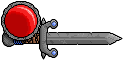  Most of my attention went to the blade and crossguard, I thought about doing some fun stuff with the stone around the health orb and handle but I got sorta bored. | |
Vermolius wrote:
I'm no professional pixel artist but let me share a few things I have learned. Yeah, you posted in the showroom, but I'm critiquing you anyway. First, don't pixel on a white background, it bothers your perception of other colors. I tend to use some desaturated grey-brown color. Another interesting point is that you should never use black, it's boring, and other colors generally convey the message much better. This also lends to your AA, if you must use dark outlines don't AA on the outside of the figure, you won't always have the same background behind it. It still looks boring; there are WAY too many shades and there needs to be more contrast between the shades. | |
UPD4T3 wrote:
It still looks boring; there are WAY too many shades and there needs to be more contrast between the shades. Indeed, it is still quite boring. I didn't bother changing his colors around either--I think maybe one. Even still, I don't really agree on the number of colors so much as I do the lack of contrast. I worked on the things I mentioned in my post. | |