Work In Progress for the Title screen for Spirit. Decided I'm going to pixel the entire thing by hand. Tell me what you guys think so far.
EDIT: BYOND made the Thumbnail look really weird oddly.
ID:320488
Feb 20 2012, 1:51 pm
|
|
Work In Progress for the Title screen for Spirit. Decided I'm going to pixel the entire thing by hand. Tell me what you guys think so far. EDIT: BYOND made the Thumbnail look really weird oddly. | |
Feb 20 2012, 1:58 pm
|
|
Dariuc
|
looks awesome
|
Kenny84 wrote:
Superfetch wrote: i spew awesome everyday. how'd you know!? | |
Lol, the thumbnail version of it looks hilariously terrible, no offense. The actual image looks like it'll be nice, but when I think of title screens for games, I mostly think more about the title name being the focus, meaning centered and bold (though the title isn't actually done). You could probably divide the characters on the two sides of the title. I think the design direction itself isn't bad, if it looks nice in the end, then all's good. I don't want to criticize needlessly, especially since I can't be sure what's the best for it, so really, the centered title is all I can suggest.
| |
Megablaze wrote:
Lol, the thumbnail version of it looks hilariously terrible, no offense. The actual image looks like it'll be nice, but when I think of title screens for games, I mostly think more about the title name being the focus, meaning centered and bold (though the title isn't actually done). You could probably divide the characters on the two sides of the title. I think the design direction itself isn't bad, if it looks nice in the end, then all's good. I don't want to criticize needlessly, especially since I can't be sure what's the best for it, so really, the centered title is all I can suggest. WIP = work in progress. Why waste your time commenting on something that's in the process and going to be changed anyway? | |
Dariuc wrote:
Megablaze wrote: Ummm...the point of posting a WIP is to get advice to try and make your art better, so he isn't wasting his time. | |
What I meant was going out of his way to fully critique what's wrong with something that's in the process. I don't think he was asking for that level of "hey whats wrong with this picture". I think he meant more on a level of design, placement, subject matter based on his game,etc.
| |
I think the composition is correct honestly continue as is in my professional opinion.
| |
@megablaze: the title would be center focus. ill probably have to lower the contrast a lot to make that happen.I was going for something along the lines of this.
http://images2.layoutsparks.com/1/84926/ kingdom-hearts-collage-army.jpg heres an update: | |
@Zane I figured one of them would look like a cowboy for someone reason lol.
| |
Zane444 wrote:
@megablaze: the title would be center focus. ill probably have to lower the contrast a lot to make that happen.I was going for something along the lines of this. Hm, I'll look forward to a final piece then, or near final if one is posted/updated. PS: Is it me, or do people really not like my comments... | |
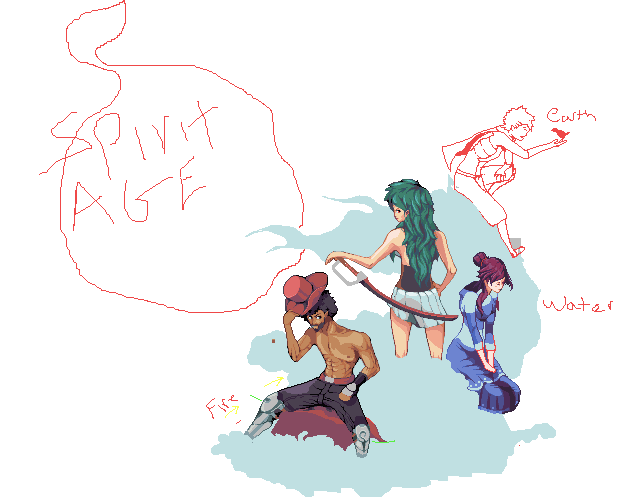
They're based on these characters:
 EDIT: I'm not sure lol, They're probably getting the wrong impression of constructive criticism.  | |
Looking forward to see the finished piece, i really like the concept of characters and colors :) Maybe the girl with green hair should be moved up a little bit, distance beetween her and the other girl is too small comparing to others. Its jus a composition thing :) But still, really great work :)
edit: the purple hair girl seems to have too long legs. Try to sit in that pose and look by yourself. | |
Zane444 wrote:
They're based on these characters: I like where you're going with this, and you did the water girl fast lol. Judging from her clothes i'm guessing her country is covered in ice? | |
@Akriloth:Correct! Each represents their country in a sense.
@Egor: I'll try putting a little distance between those two. | |
@Zane444: completely out of the blue but those your avatar have anything to do with spirit age?
| |
They are the respective head figures of each country.
| |
I think he meant your BYOND avatar. But its not hard to figure out it isnt from SA
| |
