I'm really enjoying interface creation! I struggled with it at first because it initially seemed so confusing and unintuitive, but it's great now. I think the main reason I enjoy messing with the interface so much is because when it comes to game creation I focus far more on the conceptualization than the programming mechanics.
So does anyone have any examples of their interface? What methods did you go about to make your game more appealing through the use of an attractive interface, and what kind of mechanics do you use in it?
In the RPG I'm making, each class has a multitude of skills they can learn, and so instead of dealing with cumbersome verbs I decided to make an input free interface that relies on preset macros, user hotkeys, and clickable buttons. As the player learns new skills, new buttons are added to a section of their interface which they can click on to use the skill. If they want to use the skill more frequently, they can apply that skill to a hotkey so that they only ever have to hit that key to use that skill.
http://www.byond.com/members/Zaole/files/2009-03/Zaole-0001/ sw2b.png
ID:151794
Mar 26 2009, 3:31 pm
|
|
The Magic Man wrote:
Another thing I discovered is, if you are going to use an output box to display both player to player communications, and game messages (such as "you equip this item" or "you attack the grue"). Seperate them. Game messages in none turn based games tend to end up rapidly spamming the output box, making it hard to impossible to communicate with other players. ACWraith has been big on this as well, but for the life of me I've never found any good way of making it work. I'm all ears if anyone has any suggestions as to how outputs can be separated without making them both way too small. Lummox JR | |
Tabbed outputs, although you can only see one at a time, you'll be able to keep them at full size. You could highlight the tab when a new message is received, or just automatically switch to the tab.
| |
Why not try putting each chat window in either side of a child, and have a button that switches the splitter position from 25/75 to 75/25? That way you can focus on whichever one you are more interested in at the time.
| |
Most BYOND games are made for horribly low screen resolutions, and so provide very little screen real-estate to chat outputs since the map needs to take up a lot of space to be viewable at an enjoyable scale/size.
Even online games that take up your entire screen and run with absolute *minimum* resolutions of 800x600 (and up to 1600x1200) tend to overlay chat windows transparently over the game screen; both because it allows you to chat without taking your eyes off the action, and because dedicating literally half a screen to chat output isn't feasible if nothing else can be going on in that area at the same time. This presents a problem, especially for games where text output is relevant (such as Incursion) to the gameplay in case you miss something that happens or are AFK a quick moment. This problem is even more compounded by the fact that 2D games typically don't have a 'center of attention' like 3D games do; as such, the center of the screen doesn't necessarily have to be the most important area. This means overlaying the map in general is a bad idea if you can't provide transparency and the ability to move things around / hide&show / scale by click and drag for user preference. | |
The Magic Man wrote:
One thing I learned when making interfaces is that you don't have to try and cram all the information the player needs on one screen. This definitely works very well in games. I was very impressed by Generiquest's UI and it fits the game perfectly. However, my game is focused on being more of a pick-up-and-play type of game that requires less pre-planning and reading, and more action-based elements. As such, having a simpler, compacted UI seems more effective. Another thing I discovered is, if you are going to use an output box to display both player to player communications, and game messages (such as "you equip this item" or "you attack the grue"). Seperate them. Game messages in none turn based games tend to end up rapidly spamming the output box, making it hard to impossible to communicate with other players. I've been aware of this issue and mostly indecisive. Combat numbers are displayed on the map, and since all of combat is well-animated I've made sure there's no need to include any combat info in the output at all, but there's still a lot of other stuff that can clog it up. Right now I'm still sticking with 1 window, but I might change that later. | |
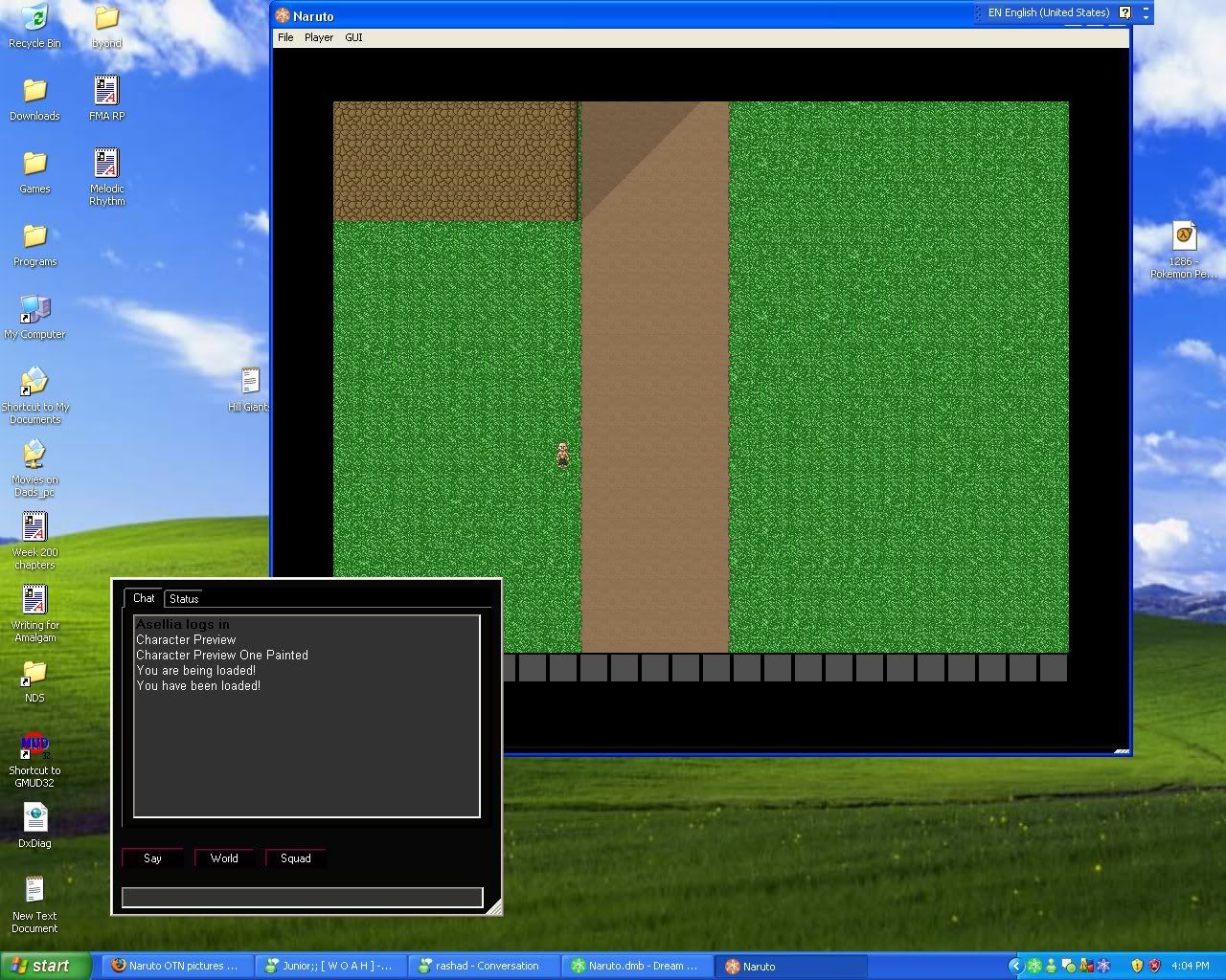
While i'm not the best with interfaces/coding, I can say that what I did here works pretty well.
http://i69.photobucket.com/albums/i76/zidane01970/ Naruto%20OTN/Screenie-1.jpg Using tabs, and << output, instead of << string | |
I used this style in a game before. The button is highlighted when messages are received.
Automatically switching to it can be very annoying, though, so highlighting works. | |
Tortch: MAkes dark stuff light
LMFAO | |
Provide them basic information that they might need to see such as a map, if the game needs it some way to communicate and then only the basic information about the player (that is relevant).
Then keep other information about the character (inventory, detailed stats, list of abilities and so on) in seperate windows that can be quickly and easily opened/closed.
Obviously doing this requires you to let people assign things in those windows (specifically items and useable abilities) to keys for quick use and access (such as from keys 1-0), but that may or may not be a downside, depending on how you look at it.
Another thing I discovered is, if you are going to use an output box to display both player to player communications, and game messages (such as "you equip this item" or "you attack the grue"). Seperate them. Game messages in none turn based games tend to end up rapidly spamming the output box, making it hard to impossible to communicate with other players.