
Heres the old one...
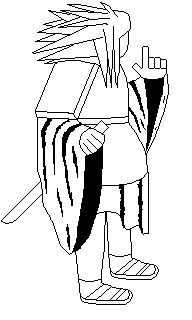
And the accual Valley of End....
C & C please.
ID:258122
Jul 5 2008, 6:29 pm
|
|
Heres the new ( and i hope its improved ) Madara.
Heres the old one... And the accual Valley of End.... C & C please. | |
Well even if you wern't going for realism then the other suggestions would help the art work look more polished then ugly
| |
W1ldr3x wrote:
Heres the new ( and i hope its improved ) Madara. I see you've fixed alot, namely his deadly hair, round featureless face and sharp cloak | |
W1ldr3x wrote:
C & C please. Bad idea on the dithering, stone is more one all diffrent levels,having a straight line of dithering isnt the way to go about it, also some of the lightsource is missing or isnt done well =P  see what i mean by diffrent levels? (this was a quick edit, if i had more time id play around with the pallet more lol) also try some line art, them big black lines arent good near the main areas of light source, hmm also the shoulder pad is curved at the top and straight at the bottem, this can effect the shading so try correcting that =P hope i helped. - Chris | |
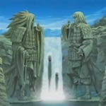
Alright, i restarted the whole thing.
I updated this so i didn't have to make a new thread. Here it is..  | |
You should redo the shape of the face and the shape of the hand. They look almost childish-cartoony. In addition, you need to work the ripples of the clothing into the outlike. This isn't a bump map or a normal map you know. :)
| |
Alright, here it is..
(hopefully) this will be the final version  | |
Make it evened out, dont jsut put some aprts light, and some parts dark, it all has to be even. If you want me to make an edit I will but I am pretty busy right now but i'll make one later if you want.
| |
I love the dithering and texturing you've done with it. Excellent job there.
However, the way you shaded it is no different than a gradient; you've flattened the statute (it has no depth; no thickness). It's kind of difficult to explain how exactly to shade it, so I decided to do a quick shading job with a four color palette.  I didn't bother with any dithering (I would have if I wanted to put more time into it), only shading, and my light source is slightly different from yours. It's also a little sloppy, but that's only because accuracy wasn't important. The idea of how you should be shading was. The idea is, you shade it as if it were a 3 dimensional object. Every part has contour and cannot be nicely shaded using what is effectively a gradient. My shading also has quite a bit more contrast, which gives the statute more depth and makes the statute look a little shiny at some spots (oops). I also changed your line art a little bit. | |
Eamples of light source http://www.spriteart.com/tutorials/02_ambient_sphere.html http://www.spriteart.com/tutorials/02_ambient_face.html
There is another tut for light source but i am not on my home computer so i don't have my links.
~X-tremEdge~